Understanding forex charts is essential for analyzing currency price movements and making informed trading decisions. These charts visually represent the fluctuations in exchange rates over specified timeframes, allowing you to identify trends, patterns, and potential trading opportunities. By mastering the interpretation of various chart types and recognizing key patterns, you can enhance your ability to predict future price movements and develop effective trading strategies.
What is a Forex Chart?
A forex chart is a visual representation of the price movements of currency pairs in the foreign exchange market over a specific period of time. It typically shows the open, high, low, and close prices of the currency pair, allowing traders to analyze trends, patterns, and make informed decisions about buying or selling currencies.
Forex charts come in different types, such as line charts, bar charts, and candlestick charts, each providing different levels of detail and information for traders. They are essential tools for technical analysis and are used by traders to track and predict future price movements in the forex market.
What Forex Charts Tell You
Exchange rate charts allow you to observe trends and other common exchange rate patterns. These all have value in predicting future exchange rate moves.
Such classic chart patterns include:
- Channels
- Ranges
- Triangles
- Head and shoulder tops and bottoms
- Double tops and bottoms
- Triple tops and bottoms
- Saucer tops and bottoms
- Flags and pennants
- Gaps
Forex charts also tell you exchange rate levels the market previously reversed to the upside at and below which buyers tend to place bids. These are known as support levels, since the market finds support there when attempting to head lower.
Similarly, the charts also show the exchange rates where the market previously reversed to the downside. Sellers tend to exist at and just above these so-called resistance levels since the market finds resistance there to upwards moves.
Some more advanced technical analysts also look at the overall structure of exchange rate moves in an attempt to identify wave patterns using the principles of Elliott Wave Theory.
In this market theory, prices move in 5 waves in the direction of a trend, while they typically correct that trend in three waves. Although sometimes a triangle will form that tends to resolve after completing five internal waves. Prices also tend to extend and correct trends in Fibonacci ratios that lead to the computation of Fibonacci projection and retracement levels.
How to Read the Main Types of Forex Charts
If you are just learning forex trading, this list should give you a good overview of how to read primary forex charts. You will find that certain forex charts give you more useful information than others. One trader might achieve soaring success using a tick chart while another hates reading tick charts and makes good money using candlestick charts.
While you may get recommendations from your friends or colleagues, you should try all these charts until you find one that you feel works best. You should not feel you are attached to one chart that worked in the past if it is not longer functional. Remaining loyal to a singular form of investment is not a wise long-term investment strategy.
Plus, you can mix these charts during your studies as you search for the best indicators.
1. Tick Charts

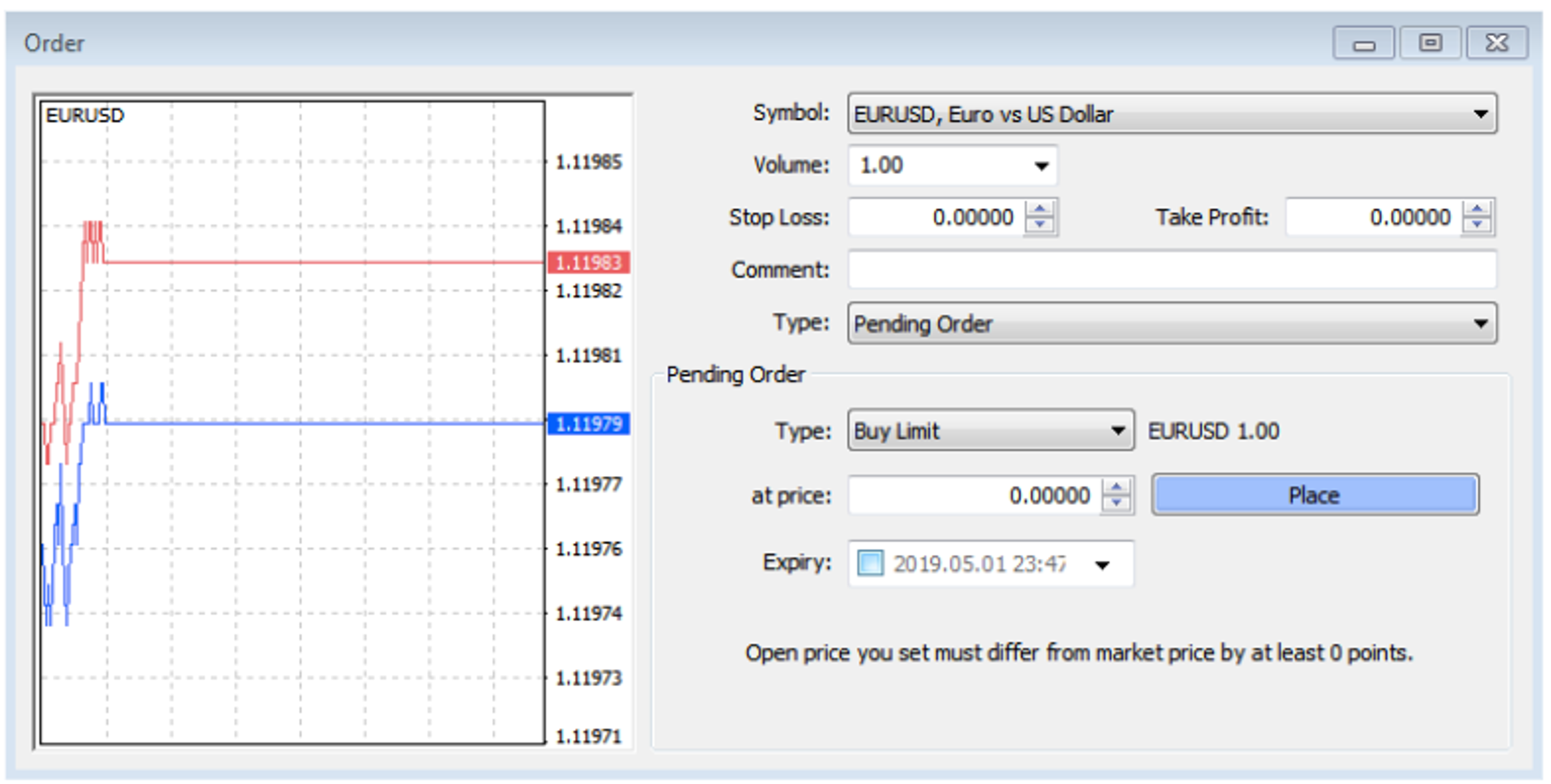
As the name suggests, tick charts have a data point drawn every time the market moves or ticks. This means there is no fixed time axis to a tick chart, so it lets a short term trader just focus on the price action. Support, resistance and trends all show up well on tick charts.
When you want to take a look at a tick chart on MetaTrader 4, for example, you can double-click on the relevant currency pair in the MarketWatch window.
A box will then pop up that allows you to enter trades or orders on the right, in addition to having a tick chart displayed on the left. The tick chart has a red line that shows the offer side and a blue line to indicate the bid side of the market.
2. Point and Figure Charts

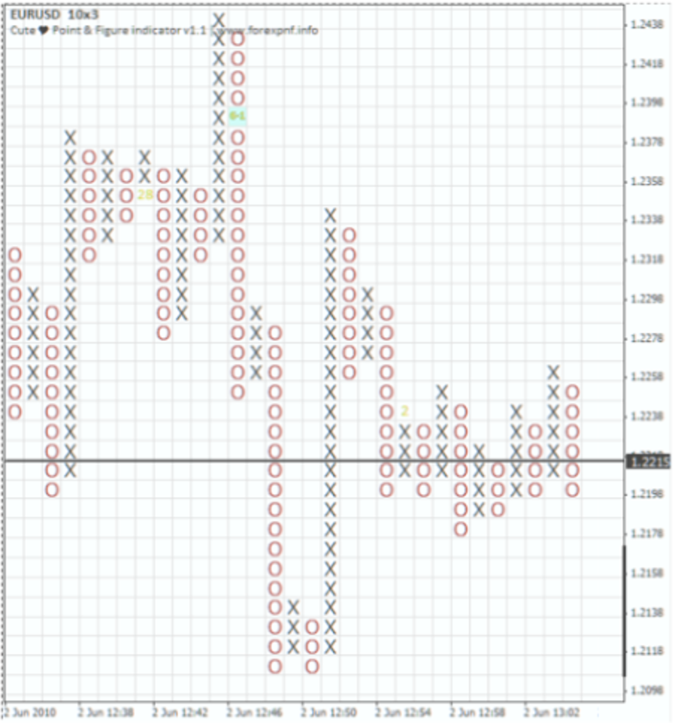
One of the most popular types of charts used by professional forex traders is the point and figure chart. This allows them to filter exchange rate moves, identify clear support and resistance levels and even trade specific patterns.
Like the tick chart, this type of chart does not have consistent time intervals on the x-axis, so it also allows a trader to focus purely on the exchange rate action.
Point and figure charts are typically constructed on graph paper by using an X to fill a rising column of boxes and an O to fill a falling column of boxes. Each box represents a specified value that the exchange rate has to attain to justify marking an X or an O on the graph.
These charts also have a parameter called a reversal, which is usually set at three boxes. This means at least a three-box move is required to switch the present column from using the X to using the O, or vice versa. Whenever a reversal occurs, the graph also progresses one column to the right.
3. Line Charts

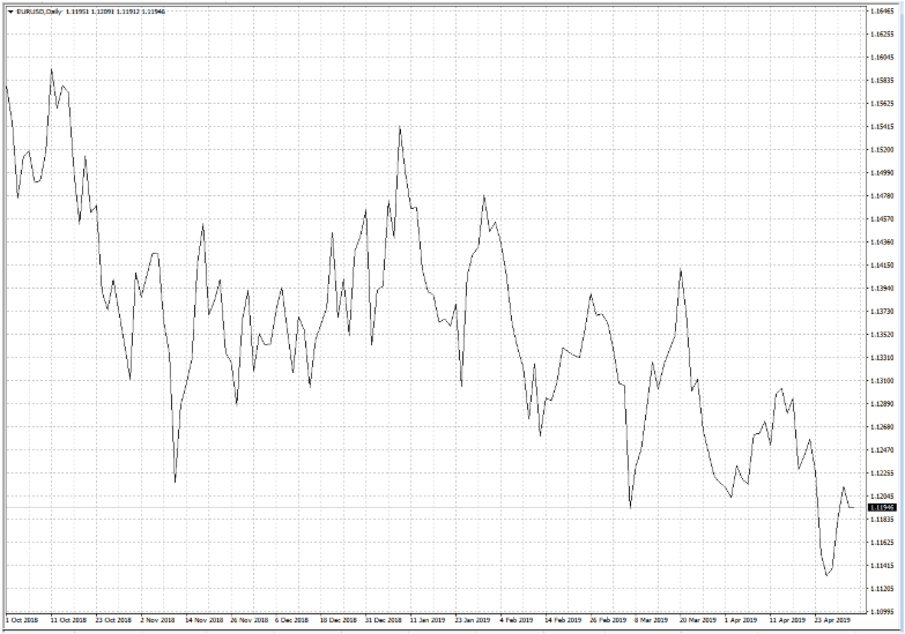
Line charts connect a set of single exchange rate observations taken per time period with a straight line. These charts most often use closing prices, although they could be drawn through high, low or opening prices instead.
Since line charts offer a relatively simplified picture of exchange rate movements, they can be used to identify overall trends and other large-scale patterns on charts. Unlike the tick chart, a line chart has an x-axis with fixed time intervals.
A line chart also helps you see short-term trends that can affect any asset. For example, you may see a steep decline related to a selloff, and you will see the stock’s recovery shortly thereafter. You can also use line charts to track the performance of a stock over long periods of time. It is easy to see, for example, that a stock dipped for a year due to negative press only to recover in conjunction with positive press.
4. Bar Charts

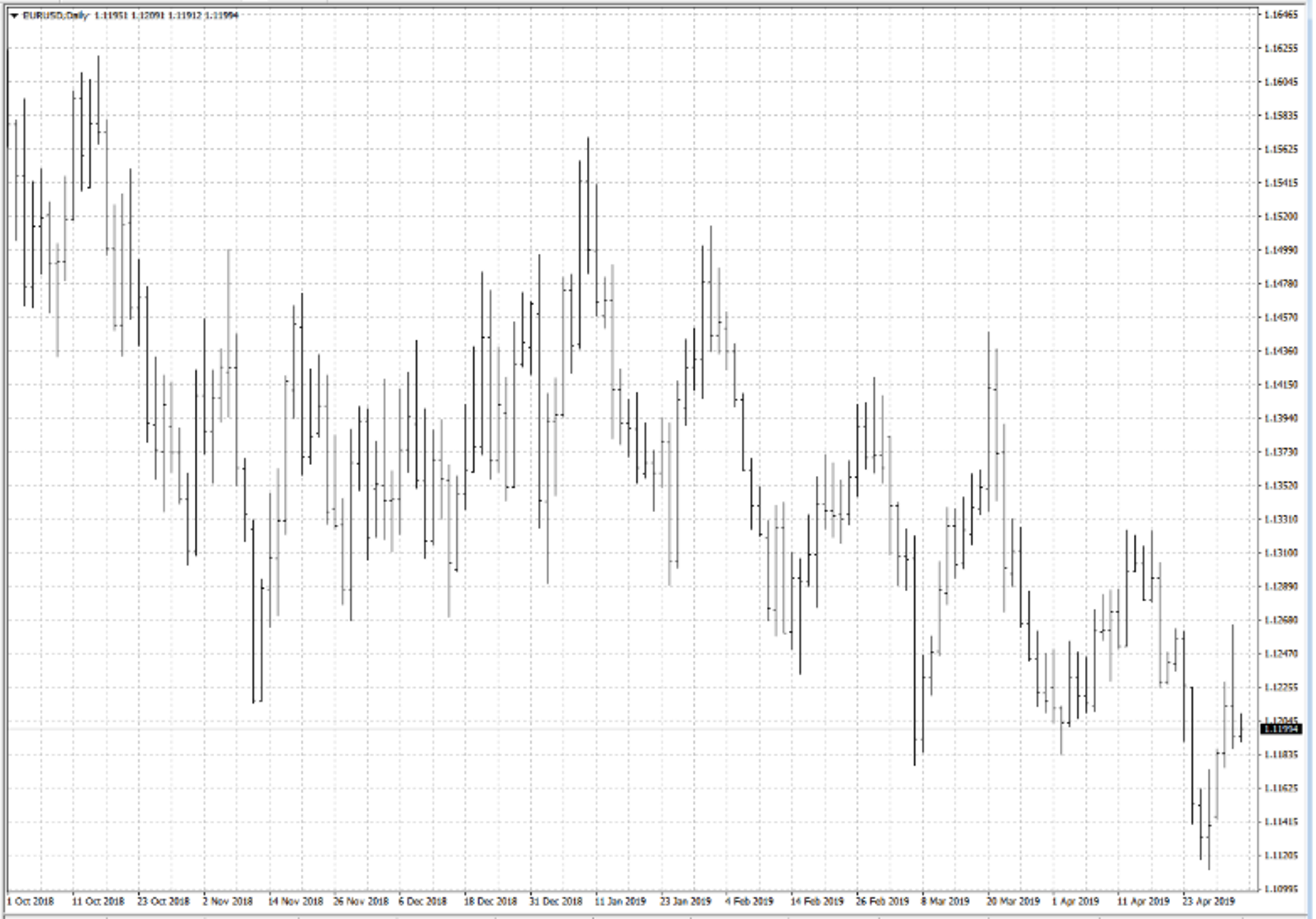
Bar charts show the high, low, open and close for each time period which together forms a bar. The high and the low are connected with a vertical line, while a small horizontal dash is shown at the open level protruding to the left. The closing level is shown by a horizontal dash to the left.
These bars are not connected to each other like the data points that make up line and tick charts are, but they do give much more information. Like line charts, bar charts also have fixed intervals on the x-axis.
Bar charts are particularly useful for identifying exchange rate gaps where the range of the first time period does not overlap that of the subsequent period. They can also be useful for ascertaining whether the market has closed above a key level in a chart pattern, which might signal a breakout.
While bar charts can reveal long-term trends, the spreads on each bar may be more difficult to interpret. If you track just one price on a bar chart, you could generate a line chart that helps you gather insight into the performance of the stock.
5. Candlestick Charts

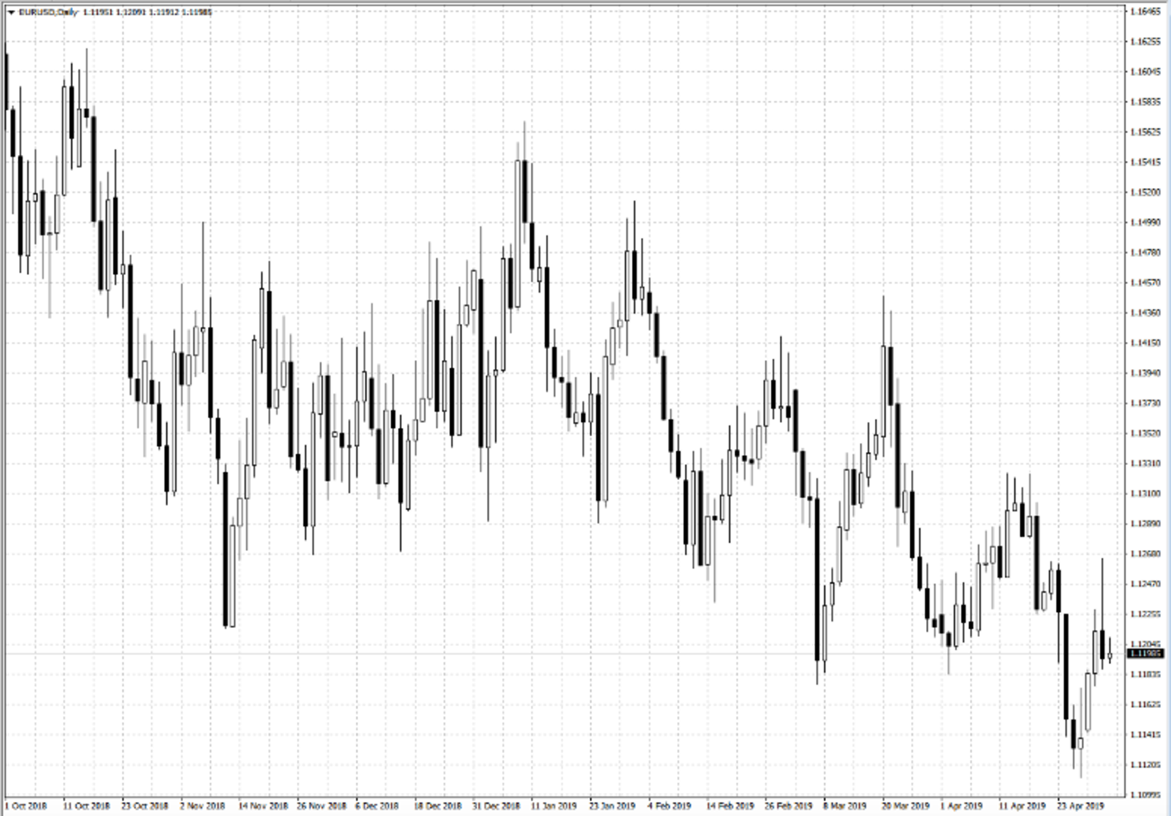
Candlestick charts are a Japanese invention that offers even more information than a bar chart because the color of the candle’s body signifies whether the market rose or fell during the particular time period.
For example, a white body can be used to show a rising or bullish candle, while a black body shows a falling (bearish) candle.
The vertical lines between the low and the open and between the close and the high are called wicks. Some candles have long wicks, others have short wicks and this can be significant when it comes to predicting subsequent market behavior.
In fact, an entire technical analysis science has evolved regarding specific combinations of candlesticks that have predictive value and can be considered chart patterns in their own right. Many of them have colorful names like the hammer, doji, hanging man and shooting star.
Compare Forex Brokers with Expert Charting Tool
- Best For:Earning Cashback on TradesVIEW PROS & CONS:securely through Forex.com's website
- Best For:Spread Betting, CFD and Forex TradersVIEW PROS & CONS:securely through City Index's website
- Best For:Professional TradersVIEW PROS & CONS:Securely through Interactive Brokers’ website
- Best For:Funding BonusVIEW PROS & CONS:securely through tastyfx's website


Using Forex Charts to Read Price Movements
Learning how to read the main forex charts can give you a huge advantage when trading, especially when you're a beginner forex trader. Remember, forex charts display the movement of an exchange rate over time, serving as a key tool for technical analysts. Traders often use these charts alongside technical indicators derived from exchange rate data and other market factors like open interest and trading volume in futures contracts.
>> Learn the best forex chart patterns
Get a Forex Pro on Your Side
FOREX.com, registered with the Commodity Futures Trading Commission (CFTC), lets you trade a wide range of forex markets with low pricing and spreads, fast, quality execution on every trade.
You can also tap into:
- EUR/USD as low as 0.0 with fixed $7 commissions per $100k USD traded
- Powerful, purpose-built currency trading platforms like MT4, MT5, TradingView, cTrader and NinjaTrader
- Monthly cash rebates with FOREX.com’s Active Trader Program
Learn more about FOREX.com powerful trading platform and how you can get started today.