Everybody knows that the current bull market has been one for the ages.
Everybody who has been long stocks for the last few years has likely enjoyed the ride.
Everybody knows that the current bull market is getting old. And yet, everybody also knows that this market has some "issues."
In response, just about everybody in the game has penned a piece or three encouraging investors to exhibit some caution toward the stock market.
After the two brutal bear markets that ensued once the "good times" in the markets ended in 2000 and 2008, investors can't be blamed for being a little squeamish right about now.
Take a look at the charts below and see if traders don't start feeling a little acrophobic.
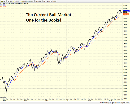
The first chart shows the S&P 500 SPY on a weekly basis since the start of the current run for the roses. This is what a gain of 190 percent looks like.
S&P 500 - Weekly

Sure it has been a struggle at times. And yes, there have been some scary moments including the Flash Crash, the various European Debt/Greece Crises, the U.S. Debt Downgrade, the Fiscal Cliff, etc. But the key is that had investors found a way to get into stocks at just about any point from March 2009 through 2012, they would have been handsomely rewarded.
Gaining Some Perspective
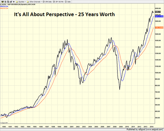
Speaking of handsome rewards, take a look at the next chart below. This is a monthly chart of the S&P 500 over a 25-year period. As is readily apparent, there have been some good times.
S&P 500 - Monthly

Oh, and as you are no doubt aware, there have been some bad times - no, make that some very, very bad times as well. Therefore, just about everybody in the game these days is worried about what happens when this bull runs out of room to run.
The Big Concern - Valuations
Other than the concept of the Fed exiting their uber-easy monetary policy next year, one of the most popular concerns about the stock market is the topic of valuation. In short, a great many folks contend that stocks are currently overvalued and some suggest that this market is wildly overvalued.
The problem is there are about a zillion ways to measure stock market valuation. Therefore, like art, the judgement of whether or not stocks are "expensive" or "cheap" usually lies in the eyes of the beholder.
Long-time readers know that this is not exactly the first go-round on this topic. In fact, we like to sit down with the valuation indicators every six months or so just to make sure there are no surprises. So, in light of the fact that vacation season is in full swing and the algos are trained on the news out of Ukraine, we figured this would be a good time to re-examine the issue.
The Price-To-Earnings Ratio: The Granddaddy of Valuation Indicators
There are currently at least 15 valuation indicators to be reviewed, including everything from P/E's to P/D's to models-of-models. So, without further ado, let's get started.
The Price-to-Earnings Ratio (P/E) is by far, the most well-known and popular market valuation indicator. The ratio measures what investors are willing to pay for $1 of earnings on the major indices.
History shows that when investors start to pay more and more for that $1 of earnings, the market quickly becomes extended. And surely as night follows day, bear markets tend to ensue when valuations become excessive.
It would be logical then for an investor to pare back their exposure to market risk when valuations are high and to put money to work in the market when valuations are low.
But here's the rub. Over- and undervaluation are moving targets. Oh, and overvalued in one environment is merely neutral in another. Thus, unless valuations are out-and-out ridiculous (think 1999), investing money based on valuations can be a fool's game.
However, attempting to glean where we are in terms of valuations within a given cycle can certainly be helpful in terms of managing risk/reward.
The Current Numbers
Another challenge in this arena is there are a plethora of ways to look at earnings and P/E ratios. Forward-looking, Trailing, GAAP earnings, Operating earnings, Median, and "normalized" to name a few. But let's start with the basics.
According to Ned Davis Research, the average P/E based on one-year forward earnings over the past 31.5 years has been 14.46. The low as seen in 1985 when the P/E was below 8 and the high was seen in 2000 when the forward P/E exceeded 22.5.
Currently, the one-year forward P/E ratio stands at 15.3, which, based on historical measures puts the market in the neutral zone in terms of valuation. And for perspective purposes, the current forward P/E is about the same as where it stood in 2007 and 1992-94.
Next up is the trailing one-year P/E ratio. And in this instance we're looking at operating earnings. So, let's break it down. The 31.5 year average is 18.12. The low was in 1985 at around 10 and the high was seen in 1999 and 2002 when it was above 29. The current reading is 17.2. So, this indicator is also smack in the middle of the range.
The problem with "operating earnings," of course, is that in this day and age, these numbers are basically whatever a company would like them to be. Therefore, it is a good idea to look at GAAP (generally accepted accounting principles) earnings, as there is a lot less fudging going on.
The low of the 31.5 year range was under 10 in 1984. The high was more than a little artificial in 2009 at 140. The non-financial crisis high was in 2002 at about 50. The average has been 22.73. And the current reading is, drum roll please... 19.1.
So, from a base-level P/E view since 1983, valuations would have to be considered neutral on balance.
Next time will look at some more variations on the Price-to-Earnings ratio.
But so far at least, there is no reason to be yelling fire.
Edge Rankings
Price Trend
© 2025 Benzinga.com. Benzinga does not provide investment advice. All rights reserved.
Trade confidently with insights and alerts from analyst ratings, free reports and breaking news that affects the stocks you care about.