Benzinga scoured Reddit for hours upon hours, hitting the "Random" button countless times, in an attempt to find the best designed subreddits out there. The list is not based on content of each subreddit, but rather solely on their aesthetic appeal. This appeal includes color schemes, the use of fonts, graphics and optimizing functionality -- namely readability.
Some interesting trends that we noticed were the prevalence of subreddits for mobile phones and Internet companies on our list; these were typically custom-designed and featured a clean, fresh look. Among the worst-looking subreddits we saw were Anime or sports-related. The intense fandom of the page's creators overwhelmed the user, resulting in pages that were distracting, hard to read or simply ugly.
We culled 30 subreddits that impressed us and listed them in no particular order. This list is by no means definitive. If you think we're missing out some well-designed subreddits, please let us know in the comments!
 1.r/Nexus4
The unofficial subreddit of this LG Android phone is flush with color and a minimalist design that emphasizes an Arial font, which is slightly larger and an aesthetic upgrade over Reddit's traditional Verdana. The enlargement of each post title (and date) is what makes the page fresh and clean.
1.r/Nexus4
The unofficial subreddit of this LG Android phone is flush with color and a minimalist design that emphasizes an Arial font, which is slightly larger and an aesthetic upgrade over Reddit's traditional Verdana. The enlargement of each post title (and date) is what makes the page fresh and clean.
 2. r/LeagueOfLegends
So many fandom subreddits fall victim to the over-the-top, featuring too many colors, graphics and general design faux pas. The League of Legends design is stylish, while remaining tasteful, introducing a relatively simple header bar design, a clean toolbar and replacing the post options' bold Verdana with a bold Arial. That minor change, coupled with the consistent use of teal result in a clean and aesthetically pleasing look.
2. r/LeagueOfLegends
So many fandom subreddits fall victim to the over-the-top, featuring too many colors, graphics and general design faux pas. The League of Legends design is stylish, while remaining tasteful, introducing a relatively simple header bar design, a clean toolbar and replacing the post options' bold Verdana with a bold Arial. That minor change, coupled with the consistent use of teal result in a clean and aesthetically pleasing look.
 3. r/LeftyGuns
There's nothing particularly artsy about r/leftyguns' design, but the clever move to swap the page arrangement for southpaw firearm enthusiasts is one that more prominent left-handed subreddits failed to capitalize on.
3. r/LeftyGuns
There's nothing particularly artsy about r/leftyguns' design, but the clever move to swap the page arrangement for southpaw firearm enthusiasts is one that more prominent left-handed subreddits failed to capitalize on.
 4. r/JoeRogan
While I don't personally know any Joe Rogan fans, the subreddit dedicated to the comedian and his podcast uses the switch to Arial font to tremendous advantage, combined with a creative and colorful header. The right sidebar featuring Rogan's upcoming podcasts is especially clean and the cannabis leaves for votes add a little spice.
5. r/KateUpton
Many attractive female models, actresses and musicians (known as part of the r/starlets network) contain a very similar design, featuring a photo of said star's face and a revealing photo on the right sidebar. While this is one of the least impressive subreddits on the list, its simplicity and the use of an edgy, bolded Franklin in the header are nice on the eyes.
4. r/JoeRogan
While I don't personally know any Joe Rogan fans, the subreddit dedicated to the comedian and his podcast uses the switch to Arial font to tremendous advantage, combined with a creative and colorful header. The right sidebar featuring Rogan's upcoming podcasts is especially clean and the cannabis leaves for votes add a little spice.
5. r/KateUpton
Many attractive female models, actresses and musicians (known as part of the r/starlets network) contain a very similar design, featuring a photo of said star's face and a revealing photo on the right sidebar. While this is one of the least impressive subreddits on the list, its simplicity and the use of an edgy, bolded Franklin in the header are nice on the eyes.
 6. r/RedditThroughHistory
r/redditthroughhistory appears on this list because its gutsy minimalism. The page contains hardly any graphics and a theme-based drab gray background, which is sharply accented by an Algerian font variation and the limited use of a creative serif. The checkboxes replacing the traditional voting arrows are a nice touch.
6. r/RedditThroughHistory
r/redditthroughhistory appears on this list because its gutsy minimalism. The page contains hardly any graphics and a theme-based drab gray background, which is sharply accented by an Algerian font variation and the limited use of a creative serif. The checkboxes replacing the traditional voting arrows are a nice touch.
 7. r/PopPunkers
This subreddit uses a bold, but simple serif to get its point across in the header, resisting the indulgence that some other music genre-themed subreddits could not. The right sidebar is full of band “stickers” whose color offsets the traditional font perfectly. Extra points for the incorporation of the Reddit Alien and a nice watermark on the page.
7. r/PopPunkers
This subreddit uses a bold, but simple serif to get its point across in the header, resisting the indulgence that some other music genre-themed subreddits could not. The right sidebar is full of band “stickers” whose color offsets the traditional font perfectly. Extra points for the incorporation of the Reddit Alien and a nice watermark on the page.
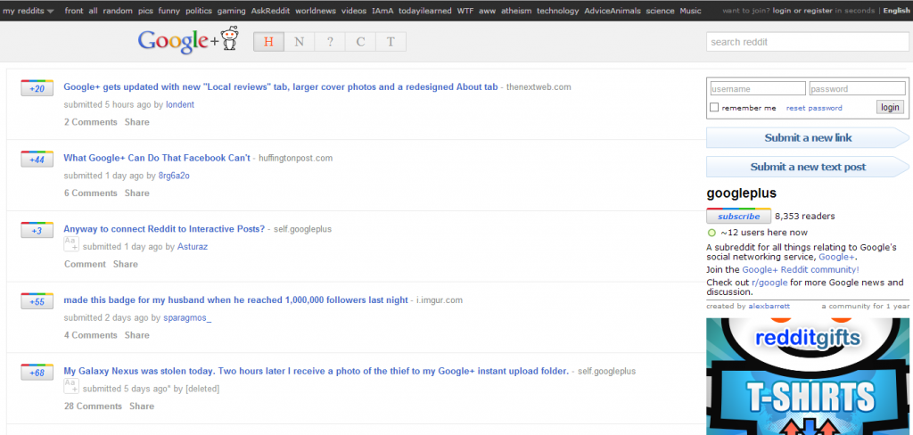 8. r/GooglePlus
The Google+ subreddit is an exercise in sticking to a theme, and the execution here is perfect, as the page is modeled after the failed Facebook alternative. The fonts are clean, the header is minimalistic but fresh and the expanded post heights make everything more readable. Facebook's subreddit doesn't even come close.
8. r/GooglePlus
The Google+ subreddit is an exercise in sticking to a theme, and the execution here is perfect, as the page is modeled after the failed Facebook alternative. The fonts are clean, the header is minimalistic but fresh and the expanded post heights make everything more readable. Facebook's subreddit doesn't even come close.
 9. r/IASIP
The popular TV show features a nice looking subreddit, although it would rank near the bottom if the list was ordered. A yellow and red color scheme is used to great success and the expanded post titles/dates give the page a far cleaner look than it would have under the default. This subreddit gets props for the random photo of Charlie and the Waitress on the sidebar, a unique watermark and perhaps the best voting graphic we've seen -- four leaf clovers!
10. r/ElectronicMusic
This subreddit dedicated to electronic music is one of the sharper ones featured on our list. The header's album collage works well, along with the edgy Franklin-style font that makes up the title. The red and charcoal color scheme is used to great effect on the right sidebar and we love the alternating white and gray backgrounds for post titles.
9. r/IASIP
The popular TV show features a nice looking subreddit, although it would rank near the bottom if the list was ordered. A yellow and red color scheme is used to great success and the expanded post titles/dates give the page a far cleaner look than it would have under the default. This subreddit gets props for the random photo of Charlie and the Waitress on the sidebar, a unique watermark and perhaps the best voting graphic we've seen -- four leaf clovers!
10. r/ElectronicMusic
This subreddit dedicated to electronic music is one of the sharper ones featured on our list. The header's album collage works well, along with the edgy Franklin-style font that makes up the title. The red and charcoal color scheme is used to great effect on the right sidebar and we love the alternating white and gray backgrounds for post titles.
 11. r/Apple
Apple is renowned for their cutting-edge design that defines their brand and its subreddit doesn't disappoint. Using traditional Apple sans-serif fonts and a gradient charcoal color scheme, the minimalist approach here works wonders. The only graphic is the colorful iMac on the right sidebar, which stands out even more within its gray confines.
12. r/Feet
Love feet or not, there's a lot to like about the design behind this potentially-NSFW subreddit. The header's backdrop of (presumably) female ankles and phalanges is accented nicely by a sleek, white title that's edgy and glitzy without going over the top. The footprint voting icons keep with the theme and a slightly altered font gives the page a clean feel.
13. r/WindowsPhone
The Windows Phone subreddit is similar to the Nexus 4, in the sense that the traditional Verdana font has been replaced by a sleek and elongated sans-serif. The background is entirely white, blurring any line between the page's header and body, and making it just that much cleaner. Its best feature is the text of sort functions just below the title.
14. r/PostProcessing
By adding just another frame and changing up the color scheme, r/postprocessing manages to make some of the best use of the Reddit default look that we've seen. The minor addition of a camera beside the “Reddit” logo in the upper left and the orange highlighting of the sort functions give the page the perfect amount of spice. Potentially, this could be improved the use of a better sans-serif for the post titles.
15. r/SwoleDominance
The destination for the buff, the ripped, the muscled, r/SwoleDominance is aesthetically impressive for many reasons. The ironically small title, combined together with sort functions save a lot of space, providing an enlarged and cleaner body, whose alternating gray and white backgrounds add tremendous readability which is only aided by the use of a larger Arial font. We're not sure who the guy in the picture on the right sidebar is, but we like it.
16. r/HailCorporate
r/HailCorporate is where redditors to go to report perceived corporate advertising on the website. This stands among the top 5 of the subreddits on this list, with a minimalistic, yet refreshing design that stands among Reddit's best. The futuristic sans-serif used in the title and alternating black-and-white font bring to mind the Wired.com logo. Like r/WindowsPhone, the line between the header and body is blurred, giving the page a spacious look that highlights sleek voting arrows and the Arial font.
17. r/BlackOps2
The subreddit for this Call of Duty installment makes use of a great orange, black and indigo color scheme. Rather than making the font skinnier and longer like other examples on this list, the page converts to Arial Black, bolding the default font for a look that's equally as appealing.
11. r/Apple
Apple is renowned for their cutting-edge design that defines their brand and its subreddit doesn't disappoint. Using traditional Apple sans-serif fonts and a gradient charcoal color scheme, the minimalist approach here works wonders. The only graphic is the colorful iMac on the right sidebar, which stands out even more within its gray confines.
12. r/Feet
Love feet or not, there's a lot to like about the design behind this potentially-NSFW subreddit. The header's backdrop of (presumably) female ankles and phalanges is accented nicely by a sleek, white title that's edgy and glitzy without going over the top. The footprint voting icons keep with the theme and a slightly altered font gives the page a clean feel.
13. r/WindowsPhone
The Windows Phone subreddit is similar to the Nexus 4, in the sense that the traditional Verdana font has been replaced by a sleek and elongated sans-serif. The background is entirely white, blurring any line between the page's header and body, and making it just that much cleaner. Its best feature is the text of sort functions just below the title.
14. r/PostProcessing
By adding just another frame and changing up the color scheme, r/postprocessing manages to make some of the best use of the Reddit default look that we've seen. The minor addition of a camera beside the “Reddit” logo in the upper left and the orange highlighting of the sort functions give the page the perfect amount of spice. Potentially, this could be improved the use of a better sans-serif for the post titles.
15. r/SwoleDominance
The destination for the buff, the ripped, the muscled, r/SwoleDominance is aesthetically impressive for many reasons. The ironically small title, combined together with sort functions save a lot of space, providing an enlarged and cleaner body, whose alternating gray and white backgrounds add tremendous readability which is only aided by the use of a larger Arial font. We're not sure who the guy in the picture on the right sidebar is, but we like it.
16. r/HailCorporate
r/HailCorporate is where redditors to go to report perceived corporate advertising on the website. This stands among the top 5 of the subreddits on this list, with a minimalistic, yet refreshing design that stands among Reddit's best. The futuristic sans-serif used in the title and alternating black-and-white font bring to mind the Wired.com logo. Like r/WindowsPhone, the line between the header and body is blurred, giving the page a spacious look that highlights sleek voting arrows and the Arial font.
17. r/BlackOps2
The subreddit for this Call of Duty installment makes use of a great orange, black and indigo color scheme. Rather than making the font skinnier and longer like other examples on this list, the page converts to Arial Black, bolding the default font for a look that's equally as appealing.
 18. r/AsianLadyBoners
We love the sleek and slender font found in the header of this subreddit, which uses the same font as r/Apple in its post titles to great effect. The red and gray color scheme works great here, and the red separator below the sort functions looks great, along with the alternating gray and white post backgrounds.
19. r/Sneakers
The significant use of the default subreddit design takes away some points from r/Sneakers, but its creative header, spelling out “Reddit” in shoelaces and a solid red-and-black color scheme put it on this list. The voting arrows in the form of the old-school Adidas logo in a nice touch.
20. r/Baconit
Baconit is a metro Reddit app for Windos Phone and it's page is awesome. The two shades of gray that make up the body background ease readability, along with the switch to a superior sans-serif font for posts. The header and subheader of sort functions looks great in the blue and dark gray color scheme, along with the buttons to “Submit a new link” and “Submit a new text post” on the right sidebar.
21. r/MeanJokes
An Arial font is used here to great effect. Instead of enlarging the spacing on the page, r/MeanJokes condenses it by reducing the font size while still allowing great readability. The title and accompanying sort functions look good, especially with the white frame (complete with its own shadow) around them.
22. r/Google
Like the Google Plus subreddit, the search engine's footprint can be seen throughout the page, which utilizes the same font as R/Apple and increases the space between lines, optimizing readability. The addition is Google colors, but the coolest features here are the frame outlining the posts as well as the sort functions, each of which has a neat icon right next to it.
23. r/Minimalism
If R/Minimalism were truly minimalist, it probably wouldn't have its name in the header, but that's a moot point. R/Minimalism possesses one of the neatest designs of any subreddit, balancing a crisp Arial font with a great blue and white color scheme. The customized sidebar is especially clean.
24. r/iWallpaper
The destination for mobile wallpaper, this subreddit blends the background of the header and body together, before yielding to a typical list of posts, accented by the use of a serif font similar to Georgia. Serifs are rare to see on Reddit, particularly as titles, but it works perfectly on this page.
25. r/DetroitRedWings
A lot of sports teams went over-the-top in team spirit in their subreddits. r/DetroitRedWings was by far the coolest we saw, combining a slick (although repetitive) header background of the hockey team's legacy and a block-D watermark. This is one of the lower subreddits on our list, but it's still highly readable. The voting arrows were replaced with a Red Wings logo as an upvote, and hilariously enough, a Blackhawks logo for a downvote.
26. r/Communism
The gathering place of Reddit's future Hugo Chavez adherents, this subreddit is minimalistic, relying on a cool red and yellow color scheme in the header, while accenting post titles in Arial font. There does not appear to be any ability to upvote or downvote any of the posts, but the graphic of Marx, Stalin and others in the upper right looks pretty nice.
27. r/Mashups
r/Mashups features the best logo of any subreddit, featuring a nice block font that changes when you mouse over, and of course, a half normal-half weird Reddit Alien. The page is fairly clean and the decision to bold the Arial font works well here.
28. r/GearsOfWar
This subreddit's unique take on the “Reddit” font is truly great and the blood splattered background, complete with the Reddit Alien is pretty captivating. The voting arrows are unique without being overwhelming, although a better design might bold the font and eliminate the repeating background image seen in the upper right.
29. r/Surface
Surface is Microsoft's tablet computer and its subreddit hits the right notes, combing the name font from r/WindowsPhone and pink voting arrows that surprisingly work out in its favor. The right sidebar is one of the cleanest we saw, although the search bar and sort function fonts could be bettered.
18. r/AsianLadyBoners
We love the sleek and slender font found in the header of this subreddit, which uses the same font as r/Apple in its post titles to great effect. The red and gray color scheme works great here, and the red separator below the sort functions looks great, along with the alternating gray and white post backgrounds.
19. r/Sneakers
The significant use of the default subreddit design takes away some points from r/Sneakers, but its creative header, spelling out “Reddit” in shoelaces and a solid red-and-black color scheme put it on this list. The voting arrows in the form of the old-school Adidas logo in a nice touch.
20. r/Baconit
Baconit is a metro Reddit app for Windos Phone and it's page is awesome. The two shades of gray that make up the body background ease readability, along with the switch to a superior sans-serif font for posts. The header and subheader of sort functions looks great in the blue and dark gray color scheme, along with the buttons to “Submit a new link” and “Submit a new text post” on the right sidebar.
21. r/MeanJokes
An Arial font is used here to great effect. Instead of enlarging the spacing on the page, r/MeanJokes condenses it by reducing the font size while still allowing great readability. The title and accompanying sort functions look good, especially with the white frame (complete with its own shadow) around them.
22. r/Google
Like the Google Plus subreddit, the search engine's footprint can be seen throughout the page, which utilizes the same font as R/Apple and increases the space between lines, optimizing readability. The addition is Google colors, but the coolest features here are the frame outlining the posts as well as the sort functions, each of which has a neat icon right next to it.
23. r/Minimalism
If R/Minimalism were truly minimalist, it probably wouldn't have its name in the header, but that's a moot point. R/Minimalism possesses one of the neatest designs of any subreddit, balancing a crisp Arial font with a great blue and white color scheme. The customized sidebar is especially clean.
24. r/iWallpaper
The destination for mobile wallpaper, this subreddit blends the background of the header and body together, before yielding to a typical list of posts, accented by the use of a serif font similar to Georgia. Serifs are rare to see on Reddit, particularly as titles, but it works perfectly on this page.
25. r/DetroitRedWings
A lot of sports teams went over-the-top in team spirit in their subreddits. r/DetroitRedWings was by far the coolest we saw, combining a slick (although repetitive) header background of the hockey team's legacy and a block-D watermark. This is one of the lower subreddits on our list, but it's still highly readable. The voting arrows were replaced with a Red Wings logo as an upvote, and hilariously enough, a Blackhawks logo for a downvote.
26. r/Communism
The gathering place of Reddit's future Hugo Chavez adherents, this subreddit is minimalistic, relying on a cool red and yellow color scheme in the header, while accenting post titles in Arial font. There does not appear to be any ability to upvote or downvote any of the posts, but the graphic of Marx, Stalin and others in the upper right looks pretty nice.
27. r/Mashups
r/Mashups features the best logo of any subreddit, featuring a nice block font that changes when you mouse over, and of course, a half normal-half weird Reddit Alien. The page is fairly clean and the decision to bold the Arial font works well here.
28. r/GearsOfWar
This subreddit's unique take on the “Reddit” font is truly great and the blood splattered background, complete with the Reddit Alien is pretty captivating. The voting arrows are unique without being overwhelming, although a better design might bold the font and eliminate the repeating background image seen in the upper right.
29. r/Surface
Surface is Microsoft's tablet computer and its subreddit hits the right notes, combing the name font from r/WindowsPhone and pink voting arrows that surprisingly work out in its favor. The right sidebar is one of the cleanest we saw, although the search bar and sort function fonts could be bettered.
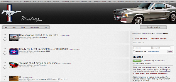 30. r/Mustang
One of the favorite subreddit designs was that of the Ford Mustang, which features the iconic logo with a beautiful ‘68 model in the upper right. The fonts are the same as the default subreddit view, but enlarged voting arrows and increased spacing between posts allow for optimized readability.
30. r/Mustang
One of the favorite subreddit designs was that of the Ford Mustang, which features the iconic logo with a beautiful ‘68 model in the upper right. The fonts are the same as the default subreddit view, but enlarged voting arrows and increased spacing between posts allow for optimized readability.
Market News and Data brought to you by Benzinga APIs
1.r/Nexus4
The unofficial subreddit of this LG Android phone is flush with color and a minimalist design that emphasizes an Arial font, which is slightly larger and an aesthetic upgrade over Reddit's traditional Verdana. The enlargement of each post title (and date) is what makes the page fresh and clean.
2. r/LeagueOfLegends
So many fandom subreddits fall victim to the over-the-top, featuring too many colors, graphics and general design faux pas. The League of Legends design is stylish, while remaining tasteful, introducing a relatively simple header bar design, a clean toolbar and replacing the post options' bold Verdana with a bold Arial. That minor change, coupled with the consistent use of teal result in a clean and aesthetically pleasing look.
3. r/LeftyGuns
There's nothing particularly artsy about r/leftyguns' design, but the clever move to swap the page arrangement for southpaw firearm enthusiasts is one that more prominent left-handed subreddits failed to capitalize on.
4. r/JoeRogan
While I don't personally know any Joe Rogan fans, the subreddit dedicated to the comedian and his podcast uses the switch to Arial font to tremendous advantage, combined with a creative and colorful header. The right sidebar featuring Rogan's upcoming podcasts is especially clean and the cannabis leaves for votes add a little spice.
5. r/KateUpton
Many attractive female models, actresses and musicians (known as part of the r/starlets network) contain a very similar design, featuring a photo of said star's face and a revealing photo on the right sidebar. While this is one of the least impressive subreddits on the list, its simplicity and the use of an edgy, bolded Franklin in the header are nice on the eyes.
6. r/RedditThroughHistory
r/redditthroughhistory appears on this list because its gutsy minimalism. The page contains hardly any graphics and a theme-based drab gray background, which is sharply accented by an Algerian font variation and the limited use of a creative serif. The checkboxes replacing the traditional voting arrows are a nice touch.
7. r/PopPunkers
This subreddit uses a bold, but simple serif to get its point across in the header, resisting the indulgence that some other music genre-themed subreddits could not. The right sidebar is full of band “stickers” whose color offsets the traditional font perfectly. Extra points for the incorporation of the Reddit Alien and a nice watermark on the page.
8. r/GooglePlus
The Google+ subreddit is an exercise in sticking to a theme, and the execution here is perfect, as the page is modeled after the failed Facebook alternative. The fonts are clean, the header is minimalistic but fresh and the expanded post heights make everything more readable. Facebook's subreddit doesn't even come close.
9. r/IASIP
The popular TV show features a nice looking subreddit, although it would rank near the bottom if the list was ordered. A yellow and red color scheme is used to great success and the expanded post titles/dates give the page a far cleaner look than it would have under the default. This subreddit gets props for the random photo of Charlie and the Waitress on the sidebar, a unique watermark and perhaps the best voting graphic we've seen -- four leaf clovers!
10. r/ElectronicMusic
This subreddit dedicated to electronic music is one of the sharper ones featured on our list. The header's album collage works well, along with the edgy Franklin-style font that makes up the title. The red and charcoal color scheme is used to great effect on the right sidebar and we love the alternating white and gray backgrounds for post titles.
11. r/Apple
Apple is renowned for their cutting-edge design that defines their brand and its subreddit doesn't disappoint. Using traditional Apple sans-serif fonts and a gradient charcoal color scheme, the minimalist approach here works wonders. The only graphic is the colorful iMac on the right sidebar, which stands out even more within its gray confines.
12. r/Feet
Love feet or not, there's a lot to like about the design behind this potentially-NSFW subreddit. The header's backdrop of (presumably) female ankles and phalanges is accented nicely by a sleek, white title that's edgy and glitzy without going over the top. The footprint voting icons keep with the theme and a slightly altered font gives the page a clean feel.
13. r/WindowsPhone
The Windows Phone subreddit is similar to the Nexus 4, in the sense that the traditional Verdana font has been replaced by a sleek and elongated sans-serif. The background is entirely white, blurring any line between the page's header and body, and making it just that much cleaner. Its best feature is the text of sort functions just below the title.
14. r/PostProcessing
By adding just another frame and changing up the color scheme, r/postprocessing manages to make some of the best use of the Reddit default look that we've seen. The minor addition of a camera beside the “Reddit” logo in the upper left and the orange highlighting of the sort functions give the page the perfect amount of spice. Potentially, this could be improved the use of a better sans-serif for the post titles.
15. r/SwoleDominance
The destination for the buff, the ripped, the muscled, r/SwoleDominance is aesthetically impressive for many reasons. The ironically small title, combined together with sort functions save a lot of space, providing an enlarged and cleaner body, whose alternating gray and white backgrounds add tremendous readability which is only aided by the use of a larger Arial font. We're not sure who the guy in the picture on the right sidebar is, but we like it.
16. r/HailCorporate
r/HailCorporate is where redditors to go to report perceived corporate advertising on the website. This stands among the top 5 of the subreddits on this list, with a minimalistic, yet refreshing design that stands among Reddit's best. The futuristic sans-serif used in the title and alternating black-and-white font bring to mind the Wired.com logo. Like r/WindowsPhone, the line between the header and body is blurred, giving the page a spacious look that highlights sleek voting arrows and the Arial font.
17. r/BlackOps2
The subreddit for this Call of Duty installment makes use of a great orange, black and indigo color scheme. Rather than making the font skinnier and longer like other examples on this list, the page converts to Arial Black, bolding the default font for a look that's equally as appealing.
18. r/AsianLadyBoners
We love the sleek and slender font found in the header of this subreddit, which uses the same font as r/Apple in its post titles to great effect. The red and gray color scheme works great here, and the red separator below the sort functions looks great, along with the alternating gray and white post backgrounds.
19. r/Sneakers
The significant use of the default subreddit design takes away some points from r/Sneakers, but its creative header, spelling out “Reddit” in shoelaces and a solid red-and-black color scheme put it on this list. The voting arrows in the form of the old-school Adidas logo in a nice touch.
20. r/Baconit
Baconit is a metro Reddit app for Windos Phone and it's page is awesome. The two shades of gray that make up the body background ease readability, along with the switch to a superior sans-serif font for posts. The header and subheader of sort functions looks great in the blue and dark gray color scheme, along with the buttons to “Submit a new link” and “Submit a new text post” on the right sidebar.
21. r/MeanJokes
An Arial font is used here to great effect. Instead of enlarging the spacing on the page, r/MeanJokes condenses it by reducing the font size while still allowing great readability. The title and accompanying sort functions look good, especially with the white frame (complete with its own shadow) around them.
22. r/Google
Like the Google Plus subreddit, the search engine's footprint can be seen throughout the page, which utilizes the same font as R/Apple and increases the space between lines, optimizing readability. The addition is Google colors, but the coolest features here are the frame outlining the posts as well as the sort functions, each of which has a neat icon right next to it.
23. r/Minimalism
If R/Minimalism were truly minimalist, it probably wouldn't have its name in the header, but that's a moot point. R/Minimalism possesses one of the neatest designs of any subreddit, balancing a crisp Arial font with a great blue and white color scheme. The customized sidebar is especially clean.
24. r/iWallpaper
The destination for mobile wallpaper, this subreddit blends the background of the header and body together, before yielding to a typical list of posts, accented by the use of a serif font similar to Georgia. Serifs are rare to see on Reddit, particularly as titles, but it works perfectly on this page.
25. r/DetroitRedWings
A lot of sports teams went over-the-top in team spirit in their subreddits. r/DetroitRedWings was by far the coolest we saw, combining a slick (although repetitive) header background of the hockey team's legacy and a block-D watermark. This is one of the lower subreddits on our list, but it's still highly readable. The voting arrows were replaced with a Red Wings logo as an upvote, and hilariously enough, a Blackhawks logo for a downvote.
26. r/Communism
The gathering place of Reddit's future Hugo Chavez adherents, this subreddit is minimalistic, relying on a cool red and yellow color scheme in the header, while accenting post titles in Arial font. There does not appear to be any ability to upvote or downvote any of the posts, but the graphic of Marx, Stalin and others in the upper right looks pretty nice.
27. r/Mashups
r/Mashups features the best logo of any subreddit, featuring a nice block font that changes when you mouse over, and of course, a half normal-half weird Reddit Alien. The page is fairly clean and the decision to bold the Arial font works well here.
28. r/GearsOfWar
This subreddit's unique take on the “Reddit” font is truly great and the blood splattered background, complete with the Reddit Alien is pretty captivating. The voting arrows are unique without being overwhelming, although a better design might bold the font and eliminate the repeating background image seen in the upper right.
29. r/Surface
Surface is Microsoft's tablet computer and its subreddit hits the right notes, combing the name font from r/WindowsPhone and pink voting arrows that surprisingly work out in its favor. The right sidebar is one of the cleanest we saw, although the search bar and sort function fonts could be bettered.
30. r/Mustang
One of the favorite subreddit designs was that of the Ford Mustang, which features the iconic logo with a beautiful ‘68 model in the upper right. The fonts are the same as the default subreddit view, but enlarged voting arrows and increased spacing between posts allow for optimized readability.© 2025 Benzinga.com. Benzinga does not provide investment advice. All rights reserved.
Benzinga simplifies the market for smarter investing
Trade confidently with insights and alerts from analyst ratings, free reports and breaking news that affects the stocks you care about.
Join Now: Free!
Already a member?Sign in

