The negative turn in the broad market in the final quarter of 2018 has cast a pall over the end of the year and 2019. The annually anticipated “Santa Claus rally” is growing less probable by the day and, even though the consensus sentiment among Wall Street analysts is that the bull market might stretch into 2019, there are a truckload of caveats that put the viability of those predictions in question.
The chart below of the S&P 500, courtesy of Finscreener’s bubble chart tool, gives a full sense of the pessimism assailing Wall Street. The X-axis shows 2018 performance and the Y-axis is 52-week price range expressed as a percentage.
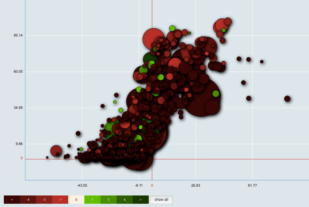
Using each circle’s color, we can get a fairly comprehensive overview of the S&P 500’s performance over the first two weeks of December as well as the year as a whole.
The most obvious takeaway from a quick glance at the above chart is that equities truly have had a miserable December, with a huge swath of deep red cutting through much of the chart, representing a more than 4 percent drop in value.
However an interesting trend this chart reveals is how many of the deepest red equities are clumped around the bottom of the y-axis. This means that stocks with the most dramatic recent losses are also widely hitting new lows for the year.
If we zoom in to the 0,0 coordinate, we can see those companies whose recent losses have put them closest to their 2018 open. The four bubbles closed to the left edge of the table below are Target Corporation TGT, Home Depot Inc. HD, BB&T Corporation BBT and JP Morgan Chase & Co. JPM.
While this might seem unsurprising, the recent drawdown is just that: recent. While the outlook for equity as a whole remains grim so long as the broad market is bearish, a positive or even neutral turn could provide a short-term bounce for stocks like these that have fallen sharply in the last couple of weeks. What’s more, the proximity to their 2018 entry price marks a strong psychological target for many of these stocks that have, until Q4, performed extremely well.
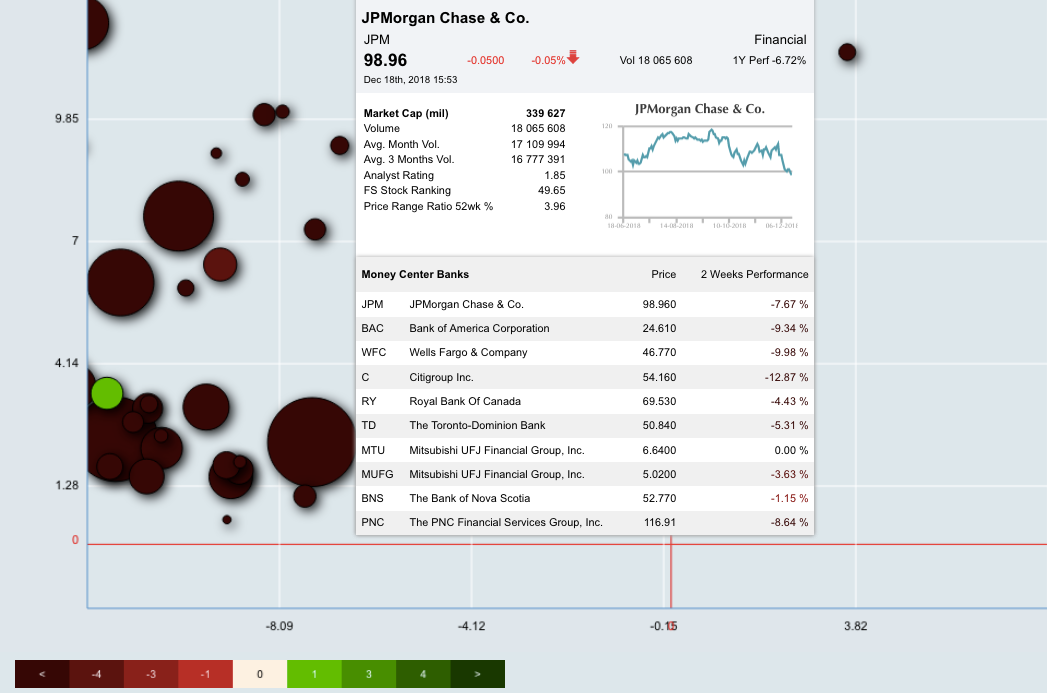
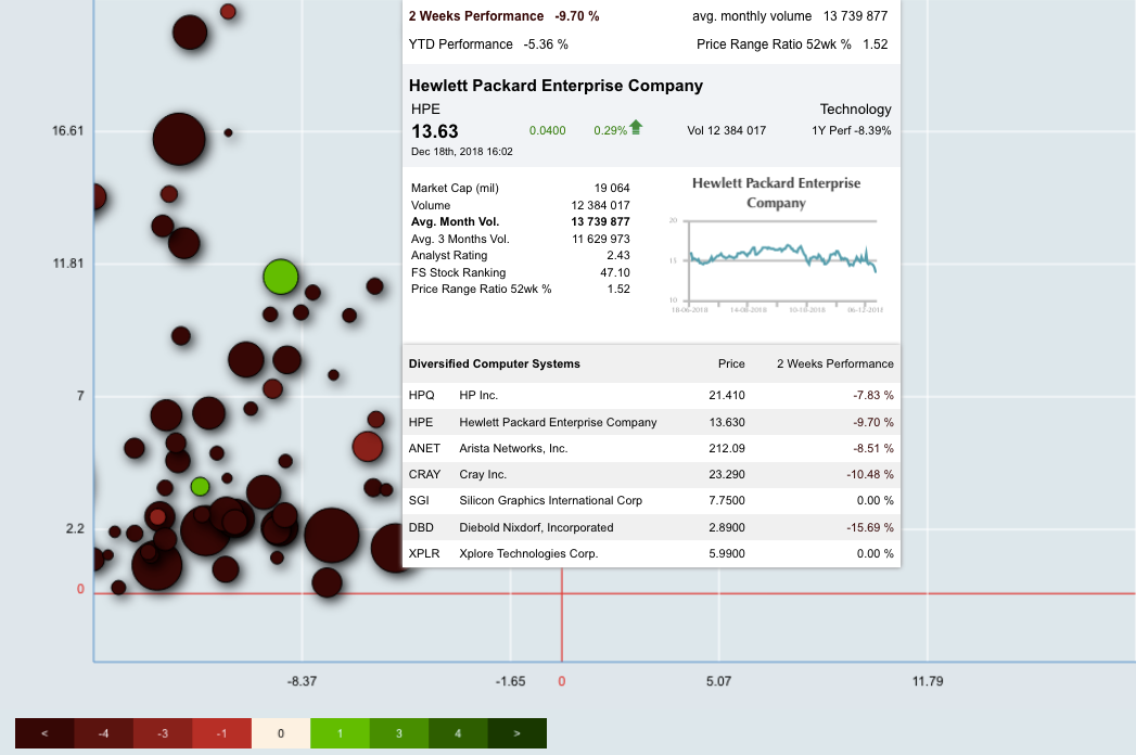
For further refinement, we can also change the criteria to reflect volume trends to see where the heaviest buying and selling pressure has been clustering. We’ll do this by changing the size of each circle to represent average monthly volume rather than market cap. The stocks with the most volume (largest bubbles) on the chart below are JP Morgan, Centurylink Inc. CTL and Hewlett Packard Enterprise Co. HPE.
The purpose of charts like these is to remind us to keep an eye on the bigger picture. There are probably a lot of stocks that have fallen enough that they are now at reasonable (or even good) valuations. But when the overall market is weak like this, everything tends to move together—good valuation or not.
For now, the only question we should be asking is “How much longer can this weakness last?”
Finscreener is a content partner of Benzinga.
© 2025 Benzinga.com. Benzinga does not provide investment advice. All rights reserved.
Trade confidently with insights and alerts from analyst ratings, free reports and breaking news that affects the stocks you care about.