Some elements of this story were previously reported by Benzinga, and it has been updated.
Wouldn’t it be nice to know how to use data to determine the perfect investment? In 1952, Harry Markowitz published an article titled “Portfolio Selection.” Prior to Markowitz, examination of investment alternatives had been primarily focused on individual assets.
Markowitz’s Nobel Prize-winning work demonstrated that investment classes should not be considered individually. Instead, investors should analyze the combined expected returns and risks of different combinations of asset classes. Markowitz looked at expected returns and risks based on historical data, using volatility as a measure of the “riskiness” of an investment.
Volatility Is Key
Here's a modern example of the type of correlations Markowitz considered: an investment in Apple Inc. AAPL and two of its suppliers, such as Broadcom Inc AVGO and Qualcomm Inc QCOM, might seem like one big investment in the iPhone. However, if the suppliers entered a price war to compete with each other, their margins would shrink and share prices might fall. Apple, on the other hand, would be paying less for its parts and would see an increase in margins (and share price).
Related Link: How Diversification Helps You Save Money
Markowitz would consider these intertwined relationships between different investments rather than the individual stocks themselves.
Markowitz's Mathematical Model
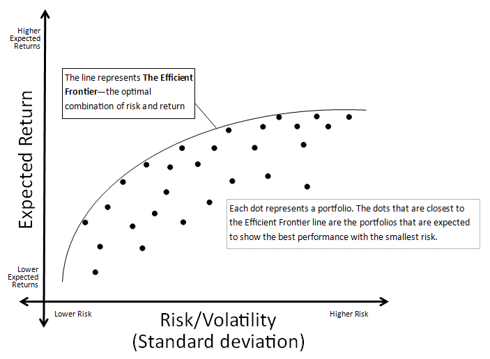
Markowitz developed his own mathematical model for determining the expected return and risk of any given combination of asset classes using historical price, correlation and volatility statistics. After building this model, he could use it to plot data points for risk versus the expected return of different portfolios on a graph such as this one:

Each of the dots on the graph represents a hypothetical portfolio with a certain combination of assets (for example, 25 percent stocks, 25 percent T-Bills, 25 percent oil and 25 percent gold). For any given risk level (x-axis) there is a wide range of expected returns based on different combinations of investments. The ideal portfolio for any risk level is the one that maximizes return and falls closest to the "Efficient Frontier Line."
Modern Take On Markowitz
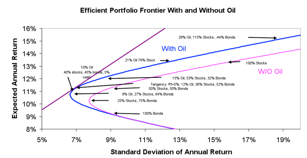
More than 50 years after Markowitz’s breakthrough paper, another Nobel Prize-winning economist applied his model to a set of modern data. The graph below was created by Robert Shiller, and the data he compiled was collected from 1983 to 2006.
Related Link: Making Money In The Stock Market Shouldn't Be Exciting 
The pink curved line represents the Efficient Frontier Line for a portfolio consisting entirely of stocks (based on returns of the S&P 500) and bonds (10-year U.S. Treasury bonds), and the blue line is the same thing but with oil added as a third investment class.
The key lesson that every investor should take away from this graph is the power of diversification. “Diversification reduces risk” might be a financial cliché, but Shiller backs it up with numbers.
Shiller And Markowitz In Practice
Imagine that an investor has the following goal: achieve a positive expected return by investing in the safest possible portfolio. Assume that this investor can choose between stocks, bonds and oil, and assume that volatility (standard deviation of annual return) is an indicator of risk. It’s not surprising to see that a portfolio of 100 percent bonds is much less risky than a portfolio of 100 percent stocks because bonds are considered safer investments than stocks.
What might not necessarily be intuitive is that, through the power of correlation and diversification, a portfolio of 25 percent stocks and 75 percent bonds (the minimum risk point or “hump” in the pink line) is actually a much safer investment than the 100 percent bond portfolio.
Diversify, Diversify, Diversify
By adding oil to the mix, the portfolio consisting of 9 percent oil, 27 percent stocks and 64 percent bonds (the minimum risk point on the blue line) was by far the safest combination of all the assets. Notice, however, that the reduction in risk did not come at the expense of expected return. The safest oil/stock/bond portfolio has a standard deviation of return that is more than 2 percent lower than the 100 percent bond portfolio, but the expected annual return is 1.5 percent higher.
A way to reduce risk while simultaneously increasing expected returns may seem too good to be true, but the numbers, and two Nobel Prize winners, say otherwise. This is the power of diversification
Photo: Shutterstock
© 2025 Benzinga.com. Benzinga does not provide investment advice. All rights reserved.
Trade confidently with insights and alerts from analyst ratings, free reports and breaking news that affects the stocks you care about.