

Weekly Wrap-Up
During the week of August 5 through August 9, 2024, the U.S. financial markets were characterized by notable volatility as the VIX tagged 65+ in a scramble for protection and a mixed performance across various sectors. /NQ was down over 5% in pre-market/globex before the Monday cash open. Key drivers of market activity included corporate earnings, economic data releases, and geopolitical developments. Despite early weakness, most corners of the market managed to catch-up by Friday close:
Corporate Earnings: The week saw significant earnings reports from major companies across multiple sectors, providing insight into the health and resilience of different industries. One of the most closely watched companies was Disney, which reported mixed results. Disney's streaming segment showed strong subscriber growth, but its media and entertainment division faced challenges, particularly in traditional cable and broadcasting. The company's earnings were impacted by ongoing disruptions in the entertainment industry, including the Hollywood writers' strike, which had a ripple effect on content production and advertising revenue.
Another major earnings report came from Uber, which showed robust growth in its ride-hailing and food delivery segments. However, the company's profitability remained a concern, with rising costs in driver incentives and marketing efforts weighing on its bottom line. Uber's stock reacted positively to the revenue growth, but the market remained cautious about its path to sustained profitability.
Sector-Specific News: The technology sector continued to be a focal point for investors, particularly in the semiconductor space. Nvidia, a leader in the semiconductor industry, reiterated strong demand for its AI chips, driven by the rapid adoption of artificial intelligence across various industries. This demand has positioned Nvidia as a key player in the tech sector's future growth. However, concerns about potential regulatory scrutiny and supply chain disruptions tempered some of the optimism surrounding the stock.
In contrast, the energy sector faced headwinds as oil prices declined during the week. The decline was driven by concerns about slowing global economic growth and its potential impact on energy demand. Energy companies, including ExxonMobil and Chevron, saw their stock prices under pressure as a result.
Geopolitical Headlines: Geopolitical developments also played a significant role in market movements during the week. Tensions in the Middle East escalated, leading to a brief spike in oil prices before they retreated. Additionally, a report from Hindenburg Research alleged that the chief of India's market regulator held investments in offshore funds linked to the Adani Group, raising concerns about potential conflicts of interest and regulatory oversight. This news sent shockwaves through Indian markets and had a ripple effect on global investor sentiment.
There were also rumblings about the Yen carry trade unwinding, causing markets to open on a large gap-down across the board and inviting extreme weakness at the start of the week, causing VIX to soar to levels not seen since 2020.
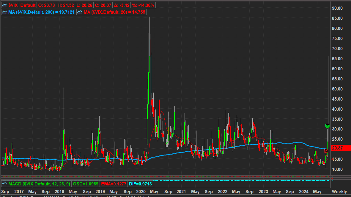
The Yen carry trade unwind refers to the reversal of a popular investment strategy where investors borrow Japanese yen at low-interest rates to invest in higher-yielding assets abroad. When global risk increases or the yen strengthens, these investors often unwind their positions by selling foreign assets and repurchasing yen, leading to yen appreciation. This can cause significant volatility in global markets, particularly in currencies and assets that were beneficiaries of the carry trade. The unwind is typically triggered by changes in interest rates or shifts in market sentiment.
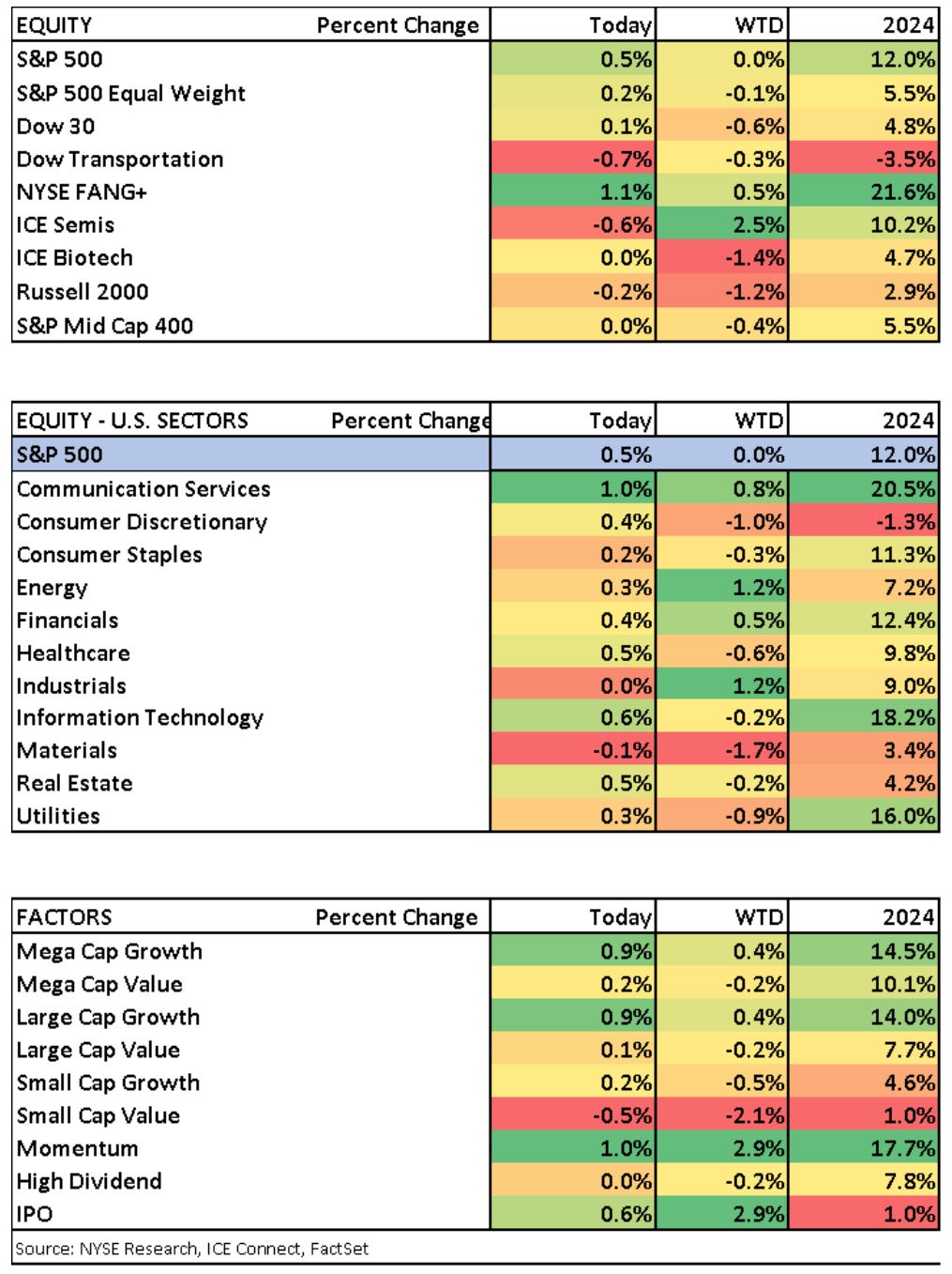
Market Performance: The S&P 500 and Dow Jones Industrial Average both experienced fluctuations throughout the week, ultimately closing slightly lower. The Nasdaq Composite, which is heavily weighted towards technology stocks, managed to eke out a small gain, driven by strength in the semiconductor sector.
Investors remained cautious as they weighed the implications of the mixed earnings reports, economic data, and geopolitical risks. The market's direction in the coming weeks was expected to be influenced by the Federal Reserve's actions, as well as any further developments in the global economy and geopolitical landscape.
Conclusion: In summary, the week of August 5 through August 9, 2024, was marked by a confluence of factors that contributed to a volatile and uncertain market environment. Corporate earnings provided a snapshot of the challenges and opportunities facing different sectors, while economic data and Fed policy added to the market's uncertainty. Geopolitical developments further complicated the market outlook, leaving investors with a cautious and watchful stance as they navigated the complexities of the global financial landscape.
This stack is certainly our most complete to date. There’s a lot to digest and none of it is filler. CPI, other important econ data and late cycle earnings in some notable names are on-deck, you can find them at the end of this stack. We’ve also included our semi-annual assessment of various investing thematics, certainly worth a moment for reflection as we’re now solidly into the back half of the year. Lastly, in the thematics section, there’s a small primer on yields; if you’ve had your head in the sand on understanding why they matter so much right now, this gentle intro might be just what you’re looking for. All the other usual suspects you’ve come to love from the weekly Market Momentum report are in here as well. Enjoy!
This Week’s Snapshots
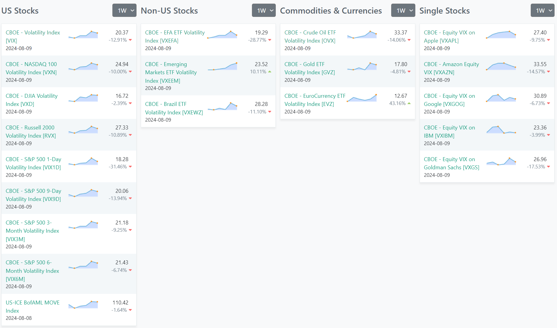
Volatility
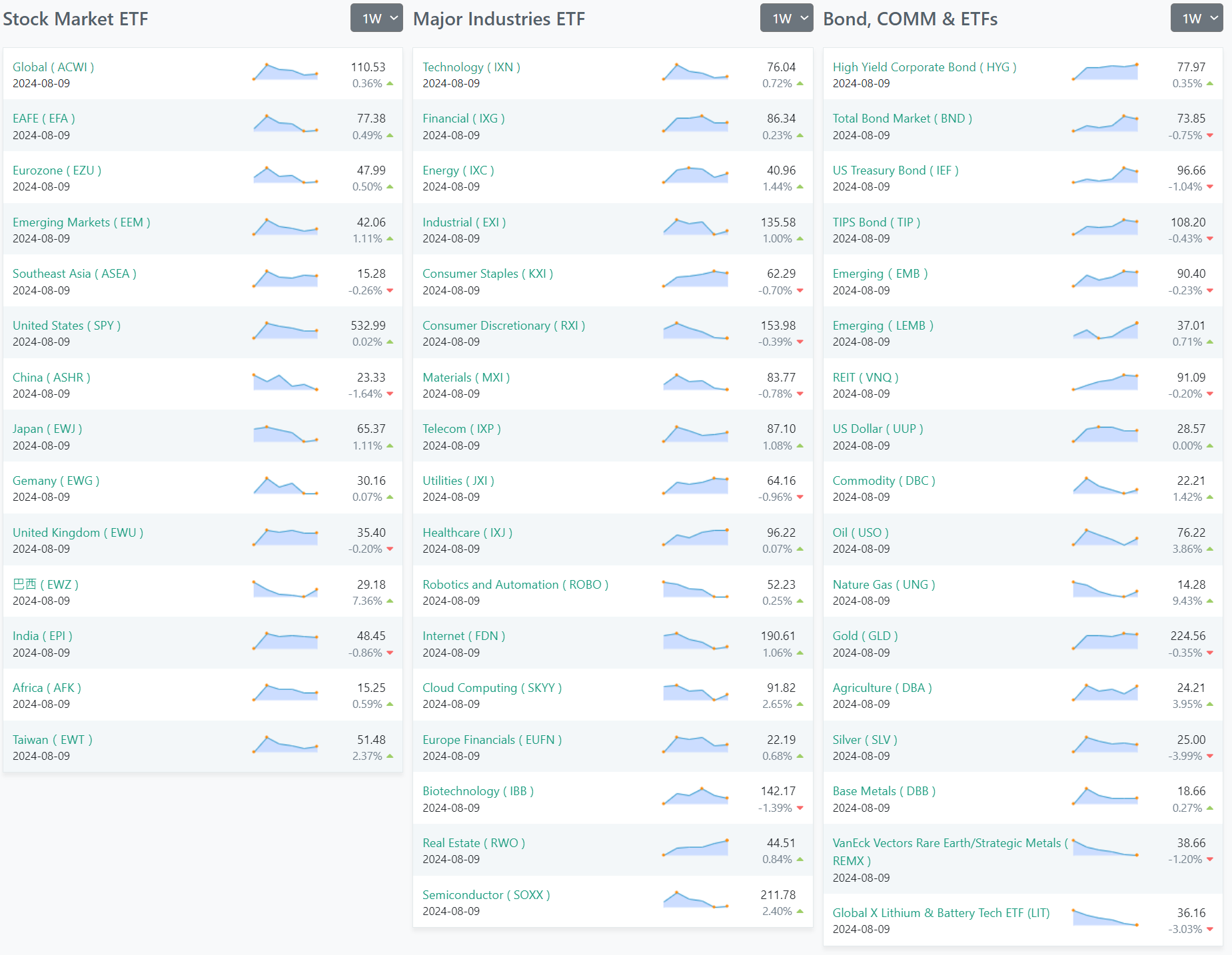
ETFs
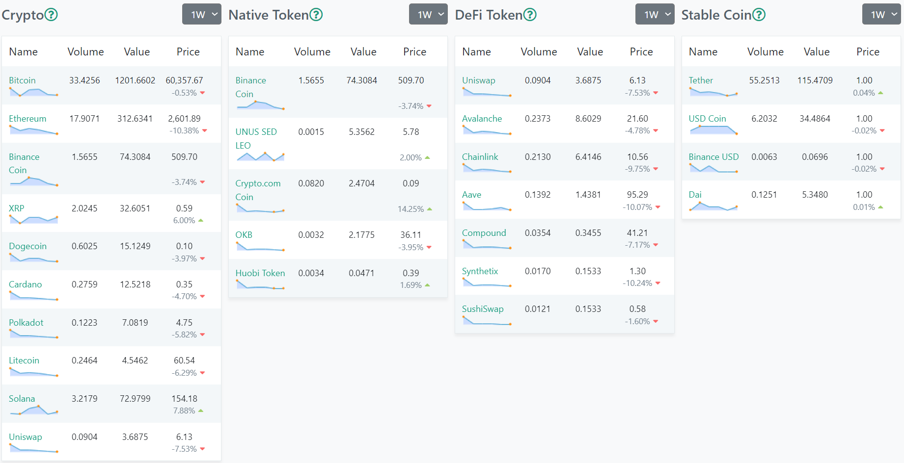
Crypto
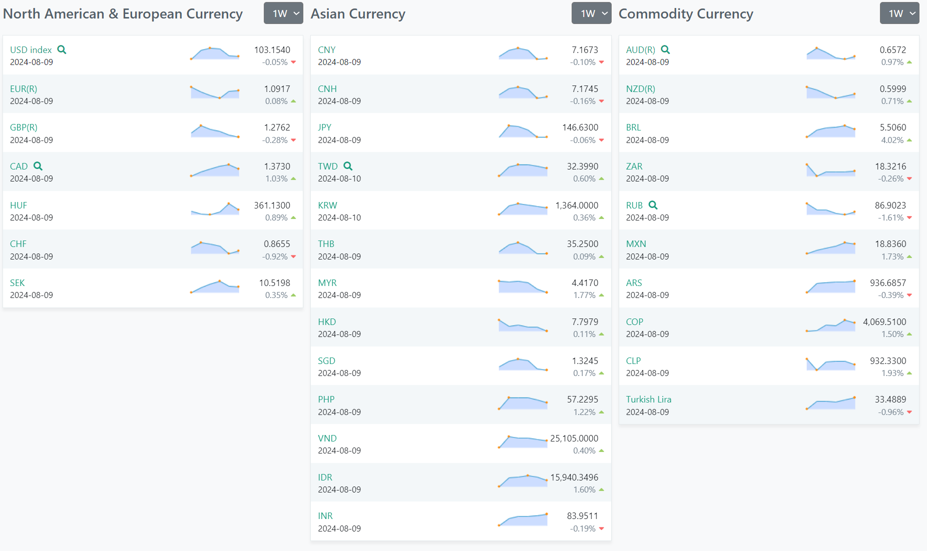
Forex
US Investor Sentiment
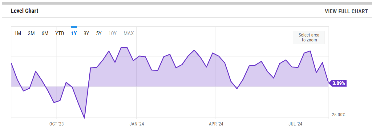
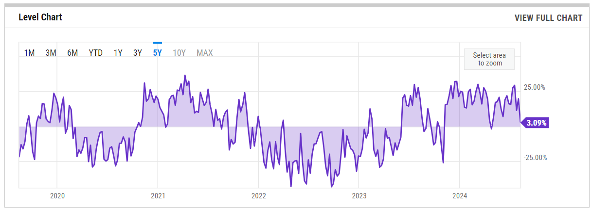
%Bull-Bear Spread
% Bull-Bear Spread is at 3.09%, compared to 19.69% last week and 27.66% last year. This is lower than the long term average of 6.66%.
1-Year View
5-Year View
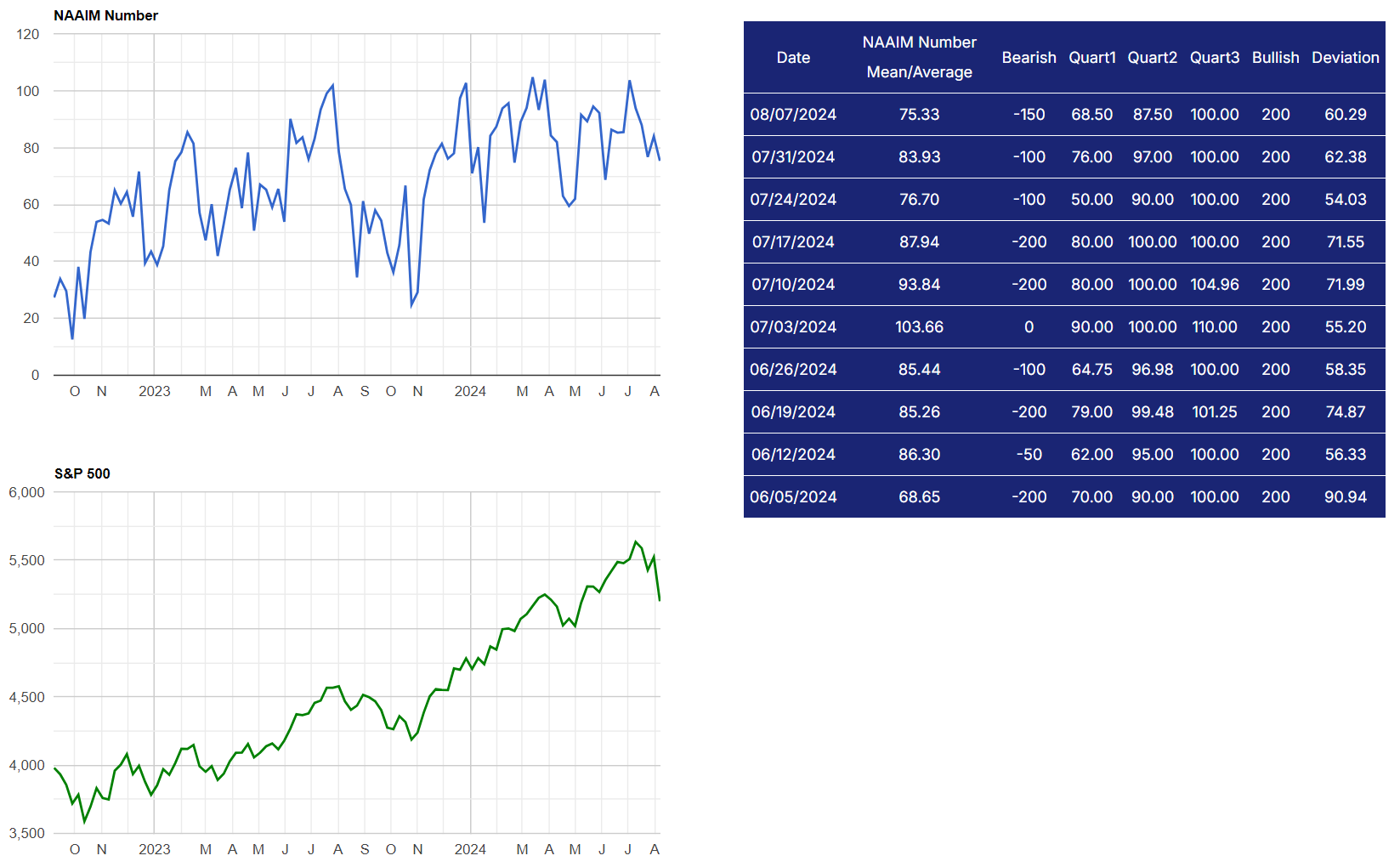
NAAIM Exposure Index
The latest NAAIM Exposure Index, as of August 7, 2024, stands at 75.33, reflecting a decrease from the previous week's value of 83.93. This indicates a slightly more cautious stance among active investment managers towards the U.S. equity markets compared to last week. The current level is also down from the same period last year, when it was recorded at 78.46.
This index measures the average exposure to the U.S. equity markets reported by NAAIM members, who are typically active money managers. A reading of 75.33 suggests that on average, these managers are moderately bullish but are reducing their equity exposure, possibly due to perceived risks in the market.
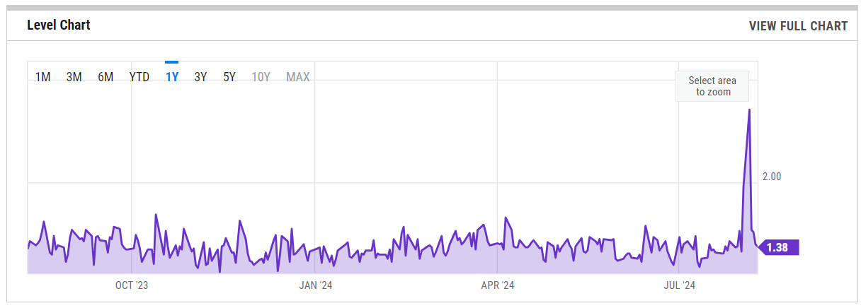
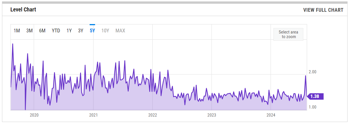
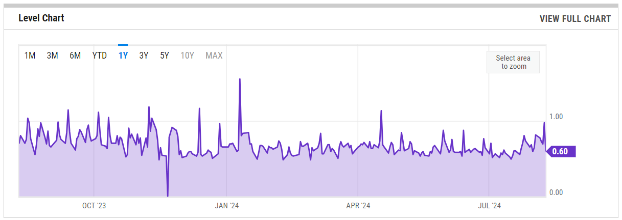
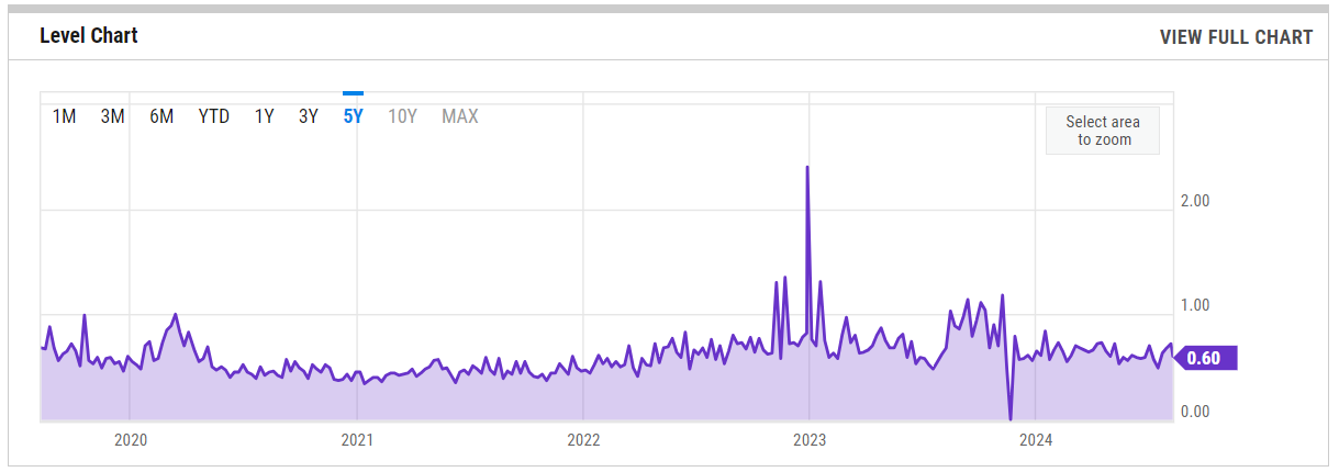
SPX Put/Call Ratio
1-Year View
5-Year View
CBOE Equity Put/Call Ratio
1-Year View
5-Year View
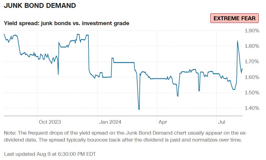
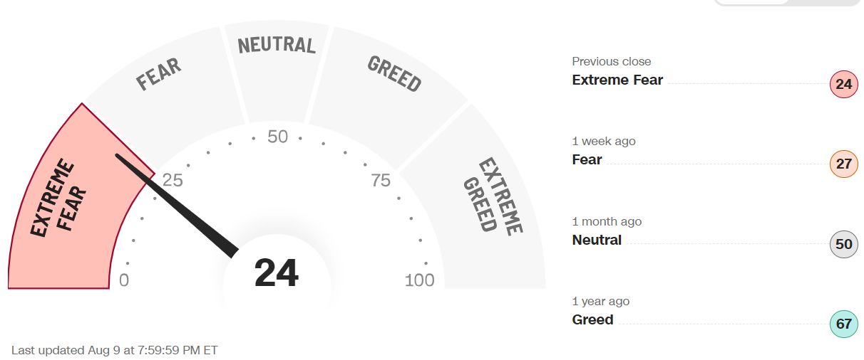
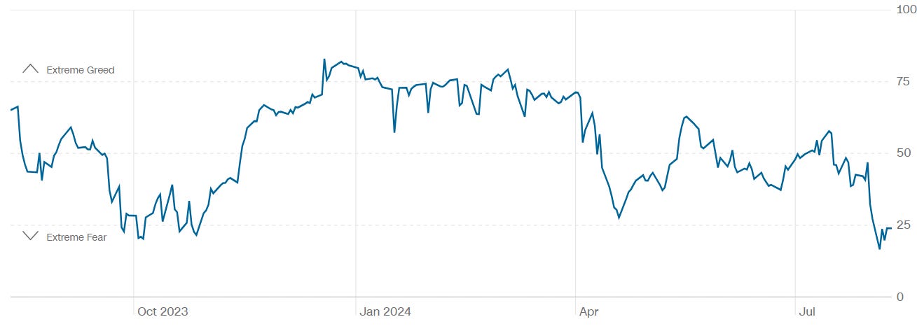
CNN 7 Fear & Greed Indicators + Composite Index
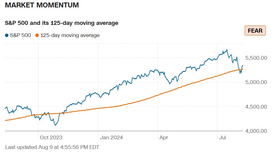
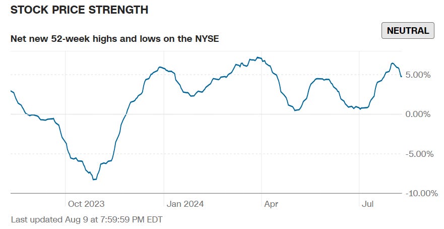
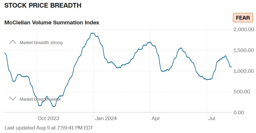
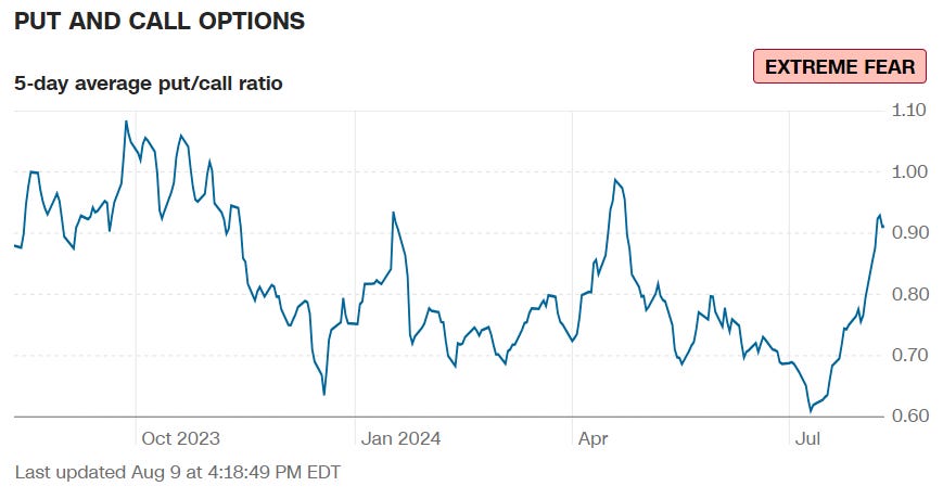
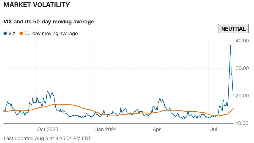
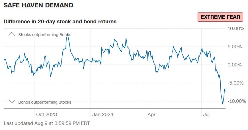
Final Composite Fear & Greed Index Reading
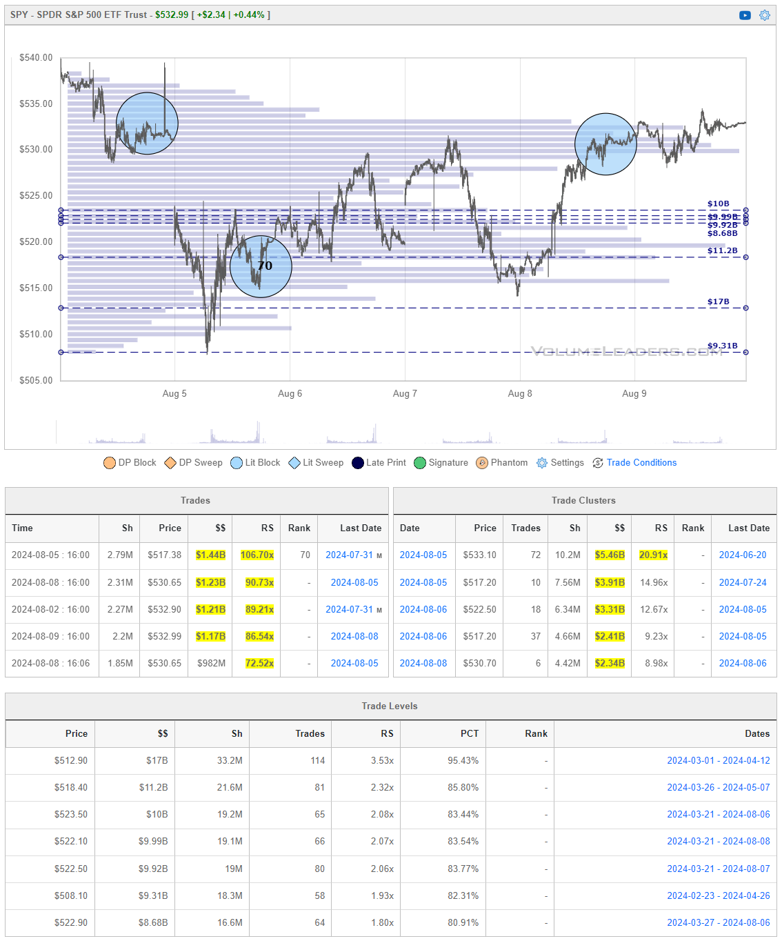
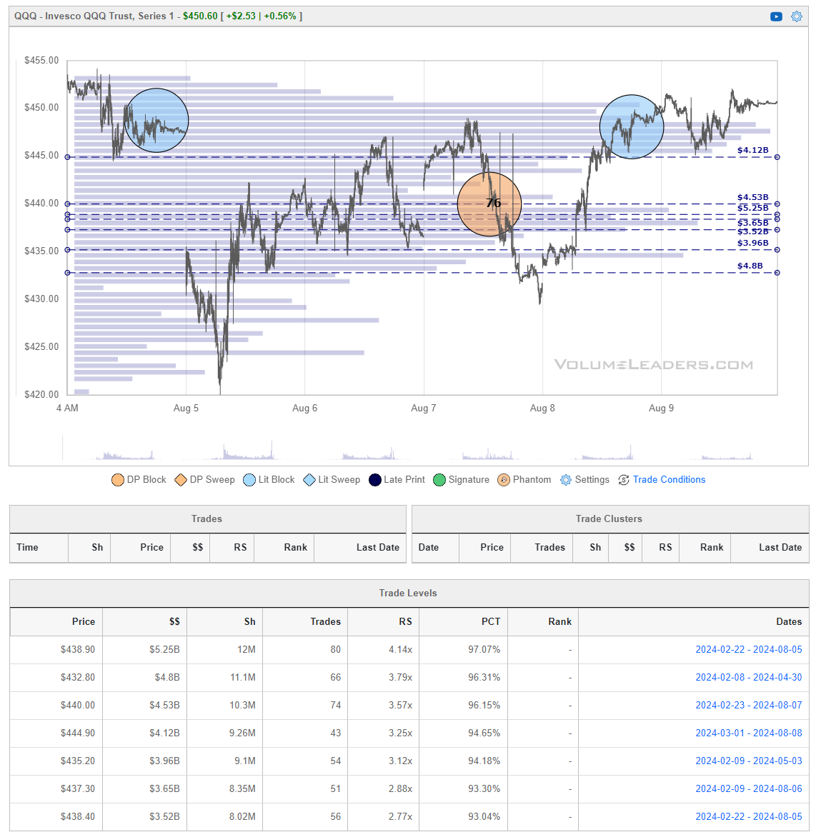
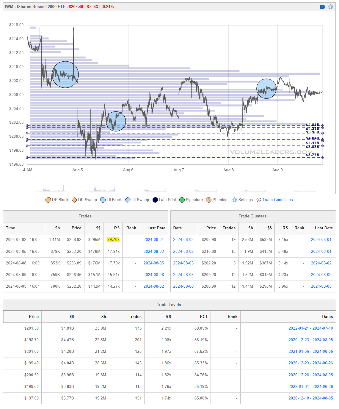
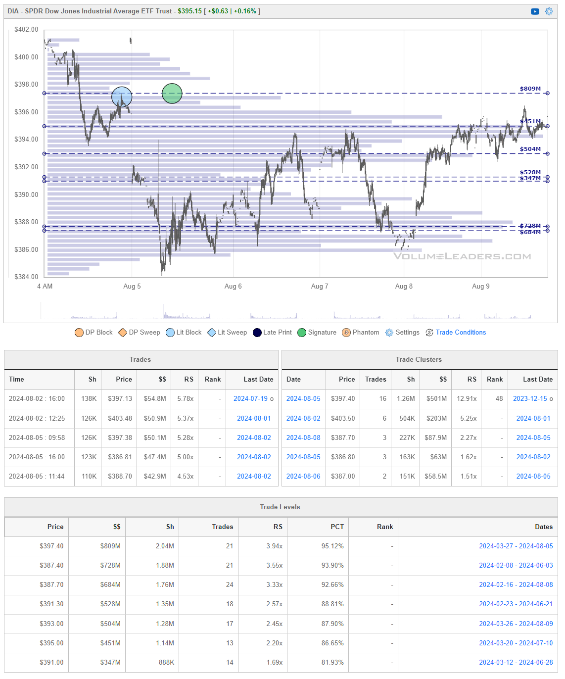
Institutional S/R Levels For Major Indices
When you’re a large institutional player, your primary goal is to find liquidity - places to do a ton of business with the least amount of slippage possible. VolumeLeaders.com automatically identifies and visually plots the exact spots where institutions are doing business and where they are are likely to return for more. It’s one of the primary reasons “support” and “resistance” concepts work and truly one of the reasons “price has memory”.
Levels from the VolumeLeaders.com platform can help you formulate trades theses about:
-
Where to add or take profit
-
Where to de-risk or hedge
-
What strikes to target for options
-
Where to expect support or resistance
This is just a small sample; there are countless ways to leverage this information into trades that express your views on the market. The platform covers thousands of tickers on multiple timeframes to accommodate all types of traders. Observe for yourself how accurate the levels are by marking-up your charts with the information in the “Trade Levels” boxes I’m giving for free below and play-along in real-time this week. These charts cover the past 7 or so sessions but subs will get new levels as they develop in real-time and have access to levels from other time frames. I’m confident you’ll see how clear-cut, intuitive and actionable this information is for yourself.
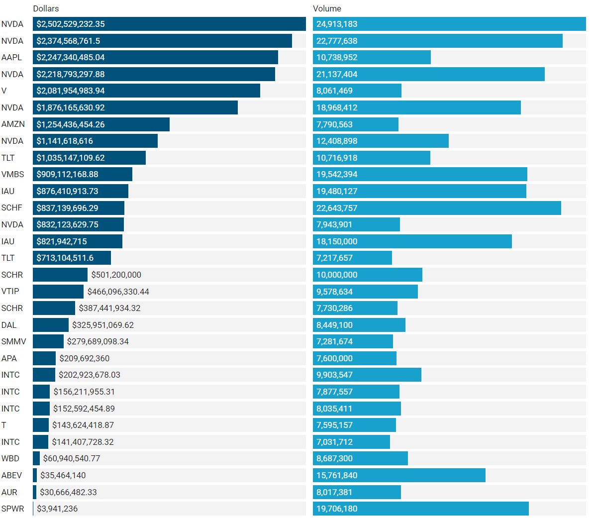
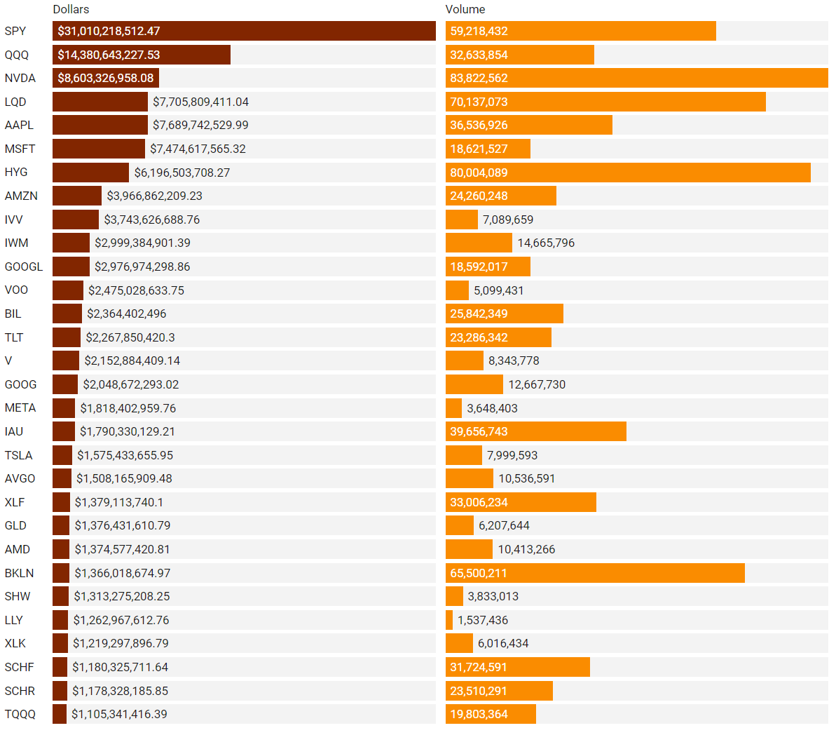
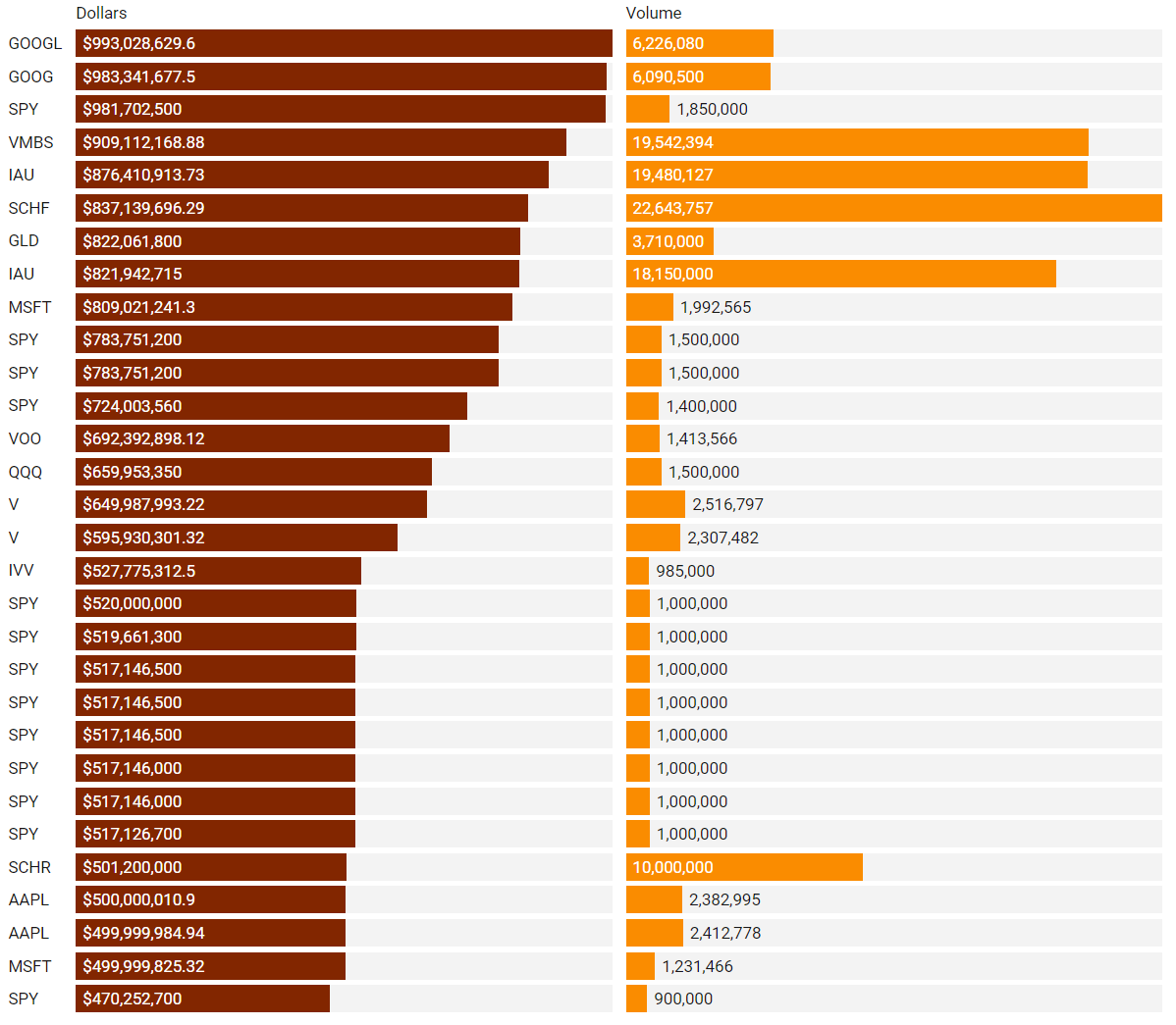
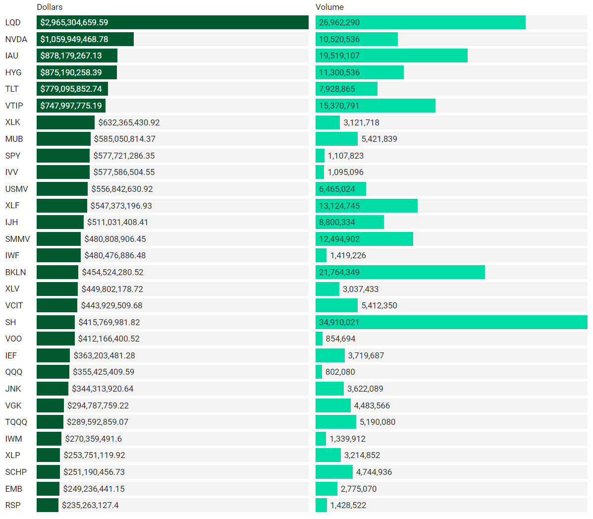
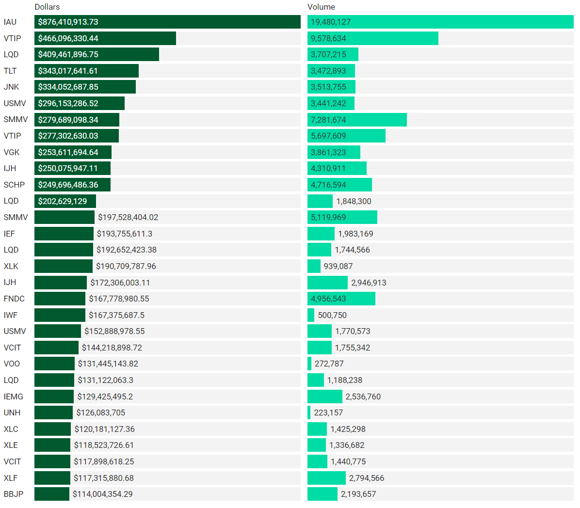
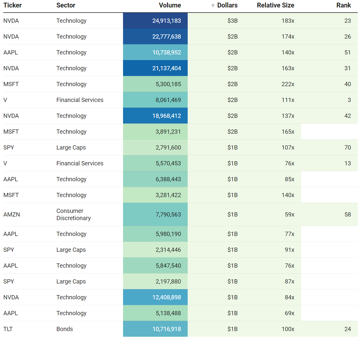
Top Institutional Order Flow
There are often great trades ideas or sources for inspiration in these prints. Only the top 30 of each group are shown but the full results are available in VL for you to browse at your leisure. Don’t forget to setup trade alerts inside the platform so you never miss institutional order flow that piques your interest or is otherwise important to you. Blue charts include all trade types including blocks on lit exchanges; red/orange charts are dark pool only trades; green charts are sweeps only.
Top Aggregate Dollars Transacted By Ticker
Largest Individual Trades By Dollars Transacted
Top Aggregate Dark Pool Activity By Ticker
Largest Individual Dark Pool Blocks By Dollars
Top Aggregate Sweeps By Ticker
Top Individual Sweeps By Dollars Transacted
Institutional S/R Levels For Individual Tickers
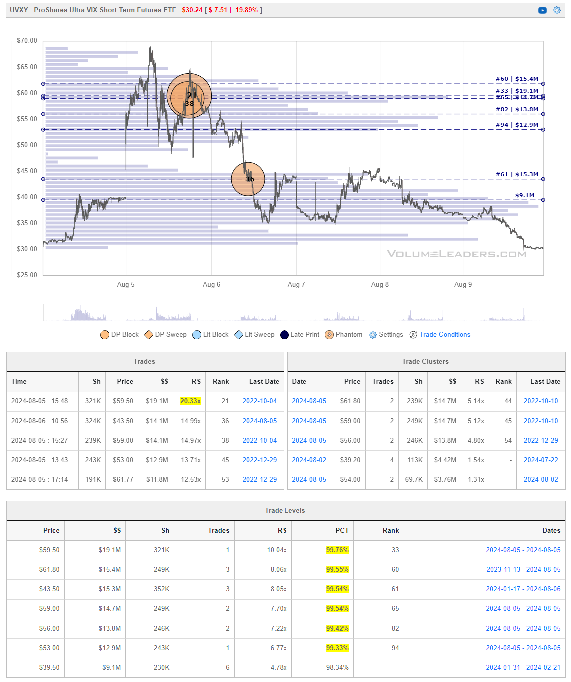
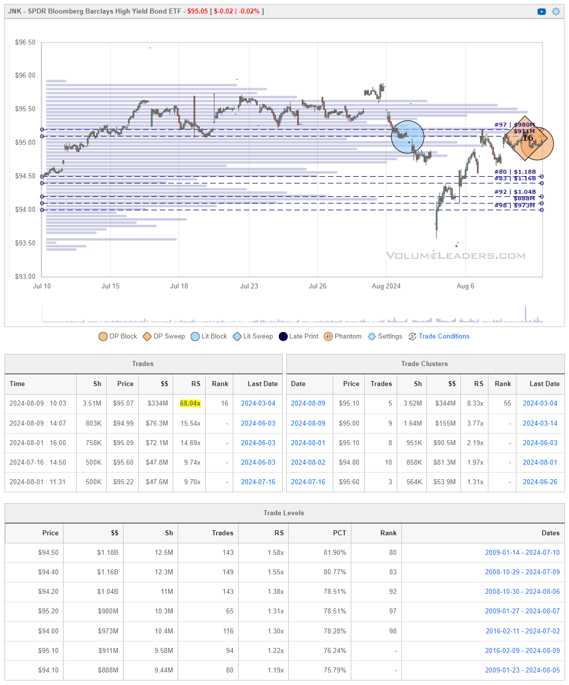
Please read “Institutional S/R Levels For Major Indices” at the top of this stack to understand the nature and importance of what we’re looking at here visually. Institutions leave footprints that VL can illustrate for you while providing context to assess things like institutional conviction and urgency.
This week, the ProShares Ultra VIX Short-Term Futures ETF (UVXY) dropped hard to close at $30.24 on August 9, 2024. The ETF's price action shows heavy selling pressure, especially on August 5 and 6, where large trade clusters were identified around $59.50 and $43.50, with corresponding volumes of $19.1 million and $15.3 million, respectively.
UVXY peaked just north of $65 after which selling pressure persisted, driving the ETF to lower levels. The largest trade of the week was recorded at $59.50 with a Relative Size (RS) of 20.33%, signaling overwhelming bearish short-term sentiment as markets stabilized and volatility subsided.
JNK showed a pattern of consolidation throughout late July and early August, mostly trading between $95.00 and $96.00. However, it opened with a substantial gap down with the rest of the market before recovering.
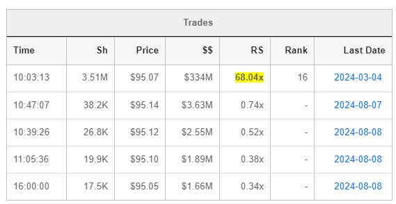
Significant trade clusters were observed on August 9 and August 1, both at the $95.10 price level. The cluster on August 9 involved a massive $334 million worth of trades, indicating substantial institutional activity. This suggests that $95.10 could be a key level of support or resistance moving forward. Most of the activity in this cluster comes from that #16 trade you see in the Trades box. With VL, it was very easy to drill into the cluster and get more details about the trades in this cluster:
JNK is considered a high-risk ticker. This is primarily due to its focus on high-yield corporate bonds, also known as "junk bonds," which are bonds issued by companies with lower credit ratings. These bonds offer higher yields to compensate investors for taking on the additional risk of default, which is more likely with lower-rated issuers.
Factors Contributing to High Risk:
-
Credit Risk: The companies issuing the bonds held by JNK are typically more financially vulnerable, leading to a higher chance of default. This is why they must offer higher interest rates to attract investors.
-
Interest Rate Sensitivity: High-yield bonds are sensitive to changes in interest rates. If interest rates rise, the value of existing bonds tends to decrease, which can negatively impact JNK's price.
-
Market Volatility: During periods of economic uncertainty or market downturns, high-yield bonds tend to be more volatile, as investors demand higher premiums for taking on additional risk.
-
Liquidity Risk: Although JNK invests in relatively liquid high-yield bonds, there is still a risk that in periods of market stress, liquidity could dry up, making it harder to buy or sell positions without affecting the price.
Testing this cluster from underneath puts the onus on buyers to step-up and reclaim the level. Keep a close eye on this one in coming sessions.
COIN, the ticker symbol for Coinbase Global, Inc., represents one of the leading cryptocurrency exchanges globally. The chart and profile show COIN holding $180 in range-bound trading and unable to find bids over $200. We’ve got institutions on lower timeframes expressing interest in this range but the higher timeframe chart in VL (subs, open the 30 day) show institutional supply still looms overhead.
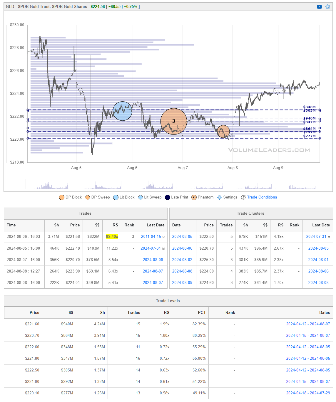
We covered IAU in the midweek issue of Fresh Prints but if you’re looking for some more Gold-data to chew on, take a look at this.
Institutions piled in hard at the relative lows and it’s already broken out of consolidation between $220 and $222.60. To fan the fire a bit, that’s a #3 ranked trade in the middle of that consolidation box. This consolidation area may get a re-test and if given the opportunity to join, everything between the #3 trade and the top of the box looks like a great place to jump in long with stops at $220.
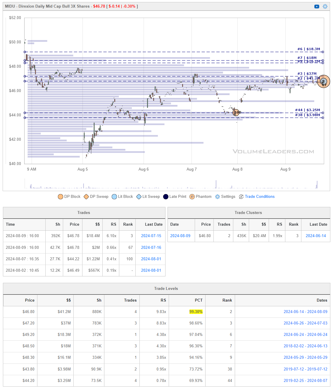
MIDU is the ticker symbol for the Direxion Daily Mid Cap Bull 3X Shares ETF. This is a leveraged exchange-traded fund (ETF) designed to provide three times (3X) the daily performance of the S&P MidCap 400 Index. It is primarily used by traders who seek to capitalize on short-term movements in mid-cap stocks. Due to its leveraged nature, MIDU is a high-risk, high-reward investment vehicle, typically used for day trading or short-term strategies rather than long-term investments.
Many charts are painting a similar pattern - dramatic gap down that was followed by a week-long recovery into last week’s close. Many are also testing prints at those levels. Though thinly traded, this week produced a #3 all-time ranked print for MIDU. If you’re looking to fade this week’s recovery, you kind of have the trifecta here:
-
Strong prior imbalance /impulse move down
-
Slow, choppy recovery to test prior prints from underneath
-
Size at local highs in a leveraged product designed for short holding periods (demonstrates a lack of conviction for a longer hold/bigger move)
There are no guarantees in what we do but it’s been my experience not to try and out-think Mr. Market; if it walks like a duck and talks like a duck…
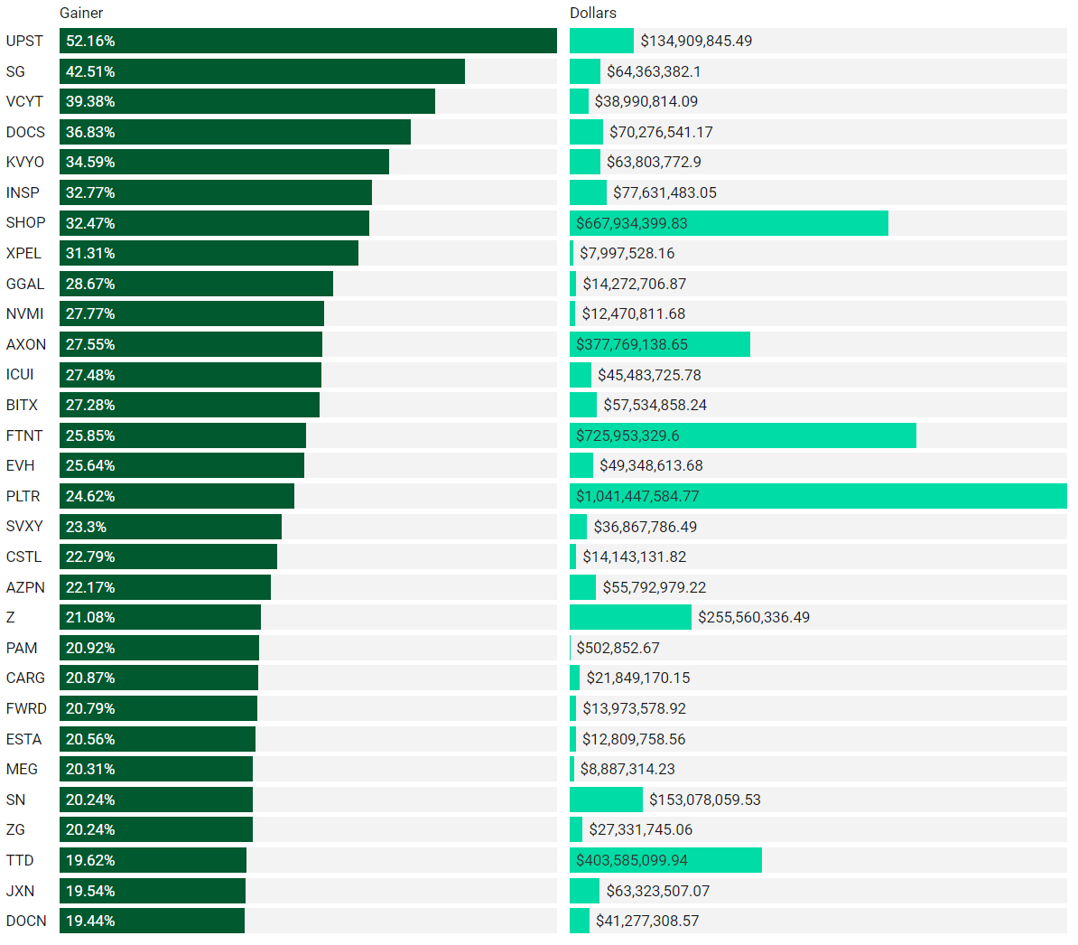
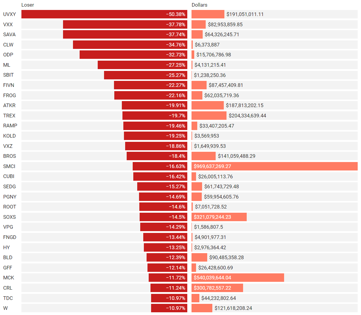
Institutionally-Backed Gainers & Losers
If you’re going to bet on a horse, consider one that is officially endorsed by an institution! These are the top percent gainers (green) and and percent losers (red) from this week’s open-to-close that had a trade price greater than $20 and institutional involvement. Continue watching tickers from prior stacks as these frequently turn into multi-leg trades with a lot of movement!
Top Institutionally Backed Gainers
Top Institutionally Backed Losers
Billionaire Boys Club
Tickers that printed a trade worth at least $1B last week get a special shout-out… Welcome to the club. Subs should login to VL to get the exact trade price and relevant institutional levels around the trade - these are massive commitments by institutions that should not be ignored.
Summary Of Thematic Performance YTD
VL provides a lot of pre-built filters for thematics so that you can quickly dive into specific areas of the market. These performance overviews are provided here only for inspiration. Consider targeting leaders and/or laggards in the best and worst sectors, for example.
We’re now half-way through the year so we’re offering our semi-annual recap of what we’re seeing YTD in each theme. The next detailed wrap-up of thematics will come at the end of the year. If we missed something important, sound-off in the comments!
S&P By Sector
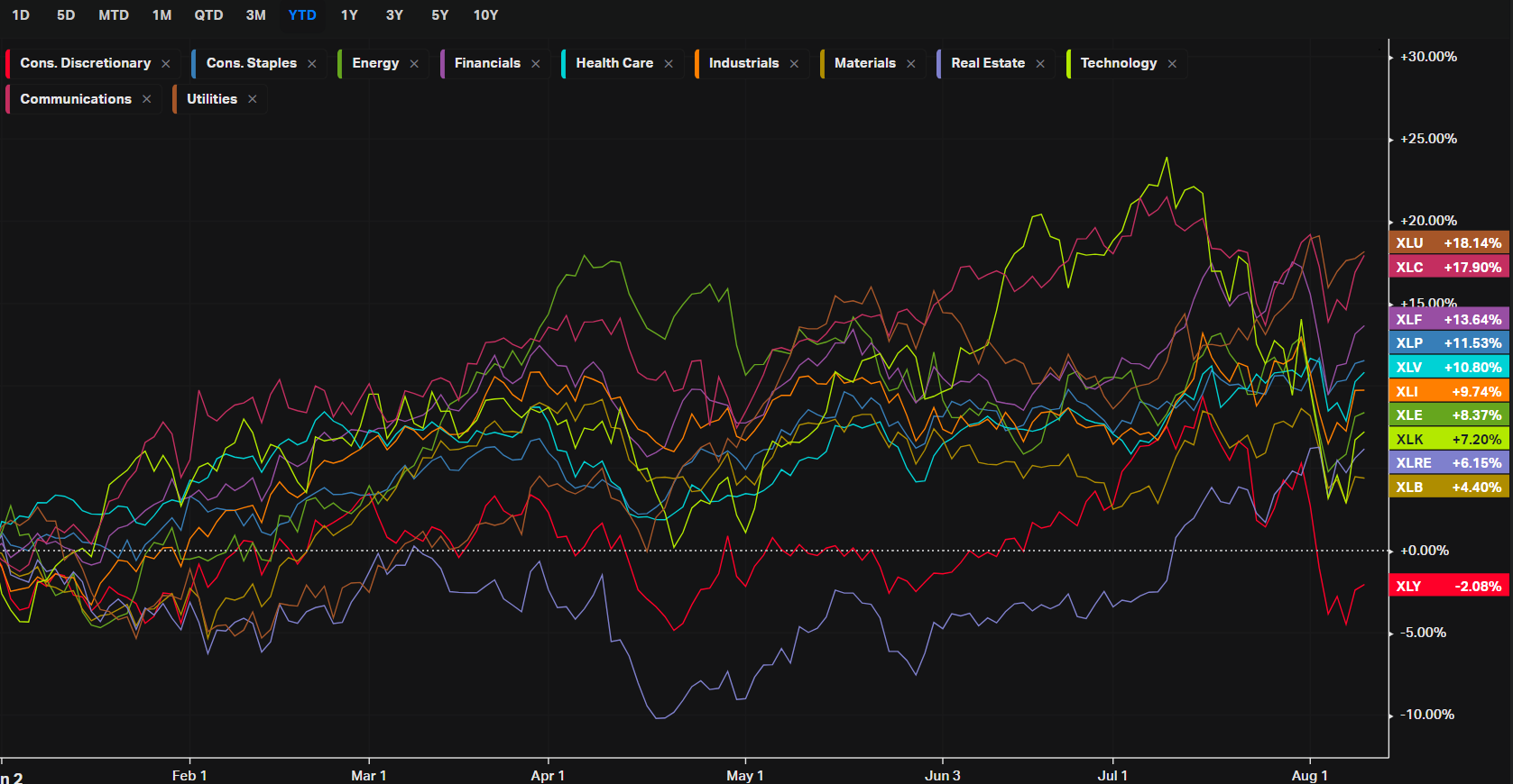
This image shows the year-to-date (YTD) performance of various sectors within the S&P 500, illustrating how different segments of the market have performed in 2024 so far. Here are some key insights:
Top-Performing Sectors:
-
Utilities (XLU):
-
Utilities have been the best-performing sector, up 18.14% YTD. This is somewhat surprising since utilities are typically considered a defensive sector with lower growth expectations. The strong performance could be due to investors seeking stability amidst economic uncertainty or lower interest rate expectations, which make the high dividend yields in utilities more attractive.
-
-
Communication Services (XLC):
-
Communication Services is another top performer, up 17.90% YTD. This sector includes major companies like Alphabet (Google) and Meta (Facebook), which have seen strong gains due to a rebound in advertising spending and optimism around AI and digital platforms.
-
-
Financials (XLF):
-
Financials have also done well, up 13.64% YTD. This reflects strong earnings from banks and financial institutions, likely benefiting from rising interest rates earlier in the year, which typically boost their net interest margins.
-
Lagging Sectors:
-
Consumer Discretionary (XLY):
-
The Consumer Discretionary sector has underperformed, down 2.08% YTD. This sector is more sensitive to economic cycles, and concerns about consumer spending amid high inflation and economic slowdown might have led to its decline.
-
-
Materials (XLB):
-
Materials are up only 4.40% YTD, making it one of the weaker-performing sectors. This sector is often impacted by global economic conditions and commodity prices, which may have faced headwinds due to concerns over economic growth, particularly in China and Europe.
-
Middle-Performing Sectors:
-
Technology (XLK):
-
Technology is up 7.20% YTD, which is solid but below some of the leading sectors. While tech stocks have had a strong long-term run, 2024's more moderate performance could be due to rising interest rates making growth stocks less attractive, or it could indicate some profit-taking after strong gains in previous years.
-
-
Energy (XLE):
-
Energy is up 8.37% YTD, benefiting from high oil prices earlier in the year. However, the sector's performance has likely been tempered by concerns over global demand and fluctuating energy prices.
-
General Insights:
-
Sector Rotation: The performance disparities suggest a degree of sector rotation, with investors moving away from growth-oriented sectors like Consumer Discretionary and Technology towards more stable, dividend-paying sectors like Utilities and Financials.
-
Economic Sensitivity: Sectors sensitive to economic cycles, such as Consumer Discretionary and Materials, have lagged, which may indicate investor caution about the strength of the economic recovery.
-
Inflation and Interest Rates: The strong performance of sectors like Financials and Utilities could reflect market expectations regarding interest rates and inflation, with utilities benefiting from a defensive shift and financials profiting from earlier rate hikes.
Overall, this chart provides a clear visual of where market strength and weakness lie in 2024, with investors showing a preference for defensive sectors amid a challenging economic environment.
S&P By Industry
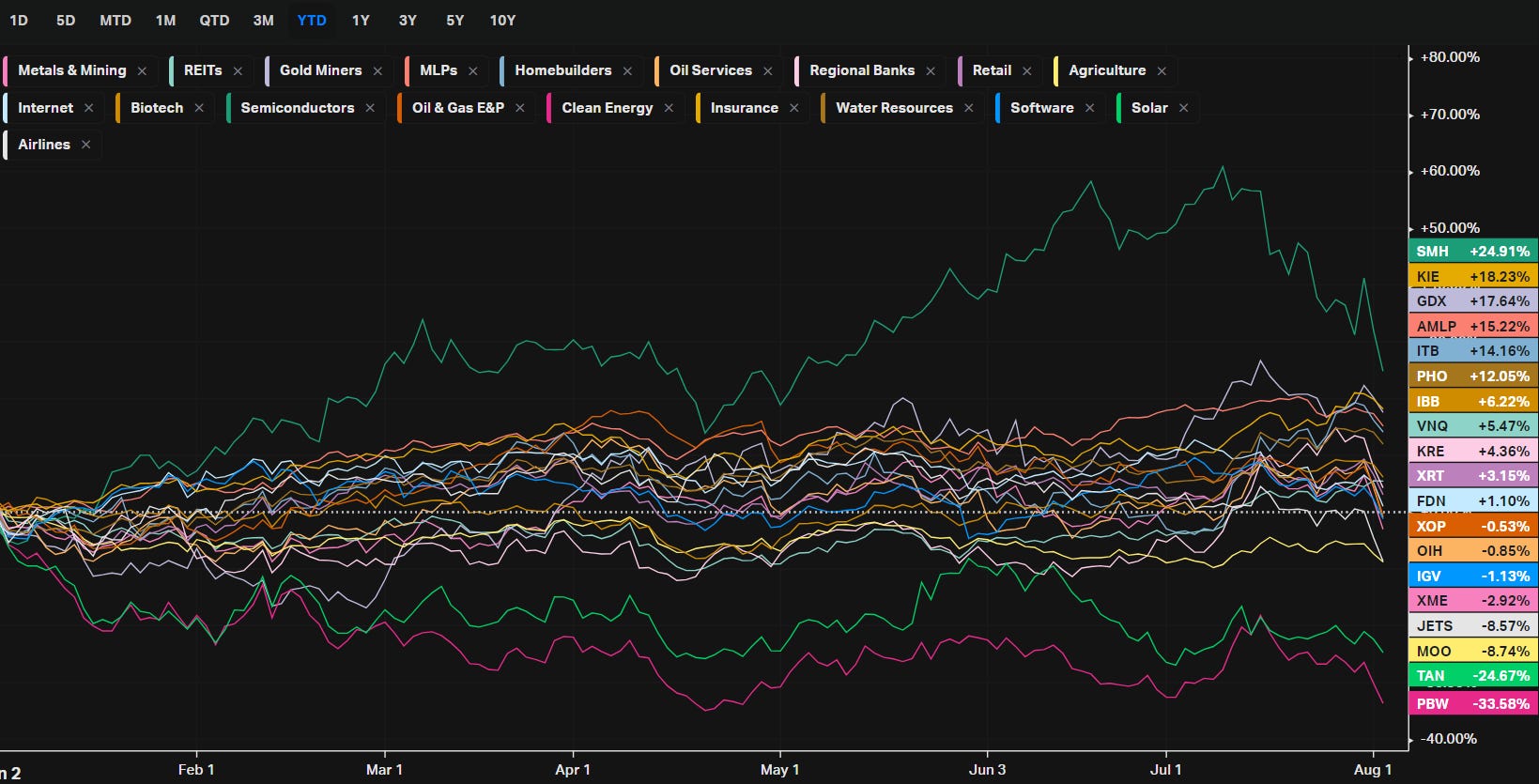
This chart illustrates the year-to-date (YTD) performance of various industries within the broader market, showing significant disparities in returns across different sectors. Here are the key takeaways:
Top-Performing Industries:
-
Semiconductors (SMH):
-
YTD Performance: Up 28.58%.
-
Key Drivers: The semiconductor industry has seen substantial gains, driven by strong demand for chips in various sectors, including AI, automotive, and consumer electronics. Companies like NVIDIA and AMD have led the charge, with AI and advanced computing applications pushing valuations higher.
-
-
Insurance (KIE):
-
YTD Performance: Up 17.25%.
-
Key Drivers: The insurance industry has benefited from rising premiums and stable claim environments. Additionally, insurers tend to perform well in higher interest rate environments, as they can generate better returns on their investment portfolios.
-
-
Gold Miners (GDX):
-
YTD Performance: Up 15.58%.
-
Key Drivers: Gold miners have gained as gold prices have increased, driven by economic uncertainty, inflation concerns, and safe-haven buying. The sector typically does well when there are fears of economic downturns or geopolitical instability.
-
Middle-Performing Industries:
-
Homebuilders (ITB):
-
YTD Performance: Up 10.32%.
-
Key Drivers: Despite higher interest rates, the homebuilding sector has held up well, likely due to strong housing demand and limited supply. Homebuilders have been able to maintain pricing power, which has supported their stock prices.
-
-
Biotech (IBB):
-
YTD Performance: Up 4.75%.
-
Key Drivers: Biotech has seen modest gains, benefiting from ongoing innovation in the healthcare sector, though it has lagged more cyclical industries. The sector remains sensitive to regulatory news and the success of clinical trials.
-
-
Retail (XRT):
-
YTD Performance: Up 2.19%.
-
Key Drivers: Retail has had a mixed year, with gains in some areas offset by concerns over consumer spending amidst inflation and economic uncertainty. While some retailers have performed well, others have struggled, leading to overall modest gains.
-
Underperforming Industries:
-
Solar (TAN):
-
YTD Performance: Down 26.17%.
-
Key Drivers: The solar industry has faced significant challenges, including rising interest rates, which increase the cost of capital for renewable energy projects. Additionally, supply chain issues and competition from other energy sources have weighed on the sector.
-
-
Clean Energy (PBW):
-
YTD Performance: Down 38.19%.
-
Key Drivers: Similar to solar, the broader clean energy sector has been hit hard, reflecting investor concerns about the viability of long-term projects in a higher rate environment. The sector's performance has also been impacted by shifts in government policy and competition from traditional energy sources.
-
-
Oil Services (OIH):
-
YTD Performance: Down 8.31%.
-
Key Drivers: Despite higher oil prices earlier in the year, the oil services sector has struggled. This could be due to concerns about future demand for fossil fuels, ongoing geopolitical risks, and the shift towards renewable energy.
-
General Insights:
-
Tech Dominance: The strong performance of the semiconductor industry underscores the continued dominance of technology, particularly in areas related to AI and advanced computing.
-
Economic Sensitivity: Industries like insurance and gold miners, which often perform well during economic uncertainty, have done well, reflecting investor caution.
-
Energy Transition Challenges: The sharp declines in solar and clean energy industries highlight the challenges facing the energy transition, particularly in a higher interest rate environment.
This chart underscores the importance of industry selection in 2024, with significant divergences in performance across sectors.
Energy
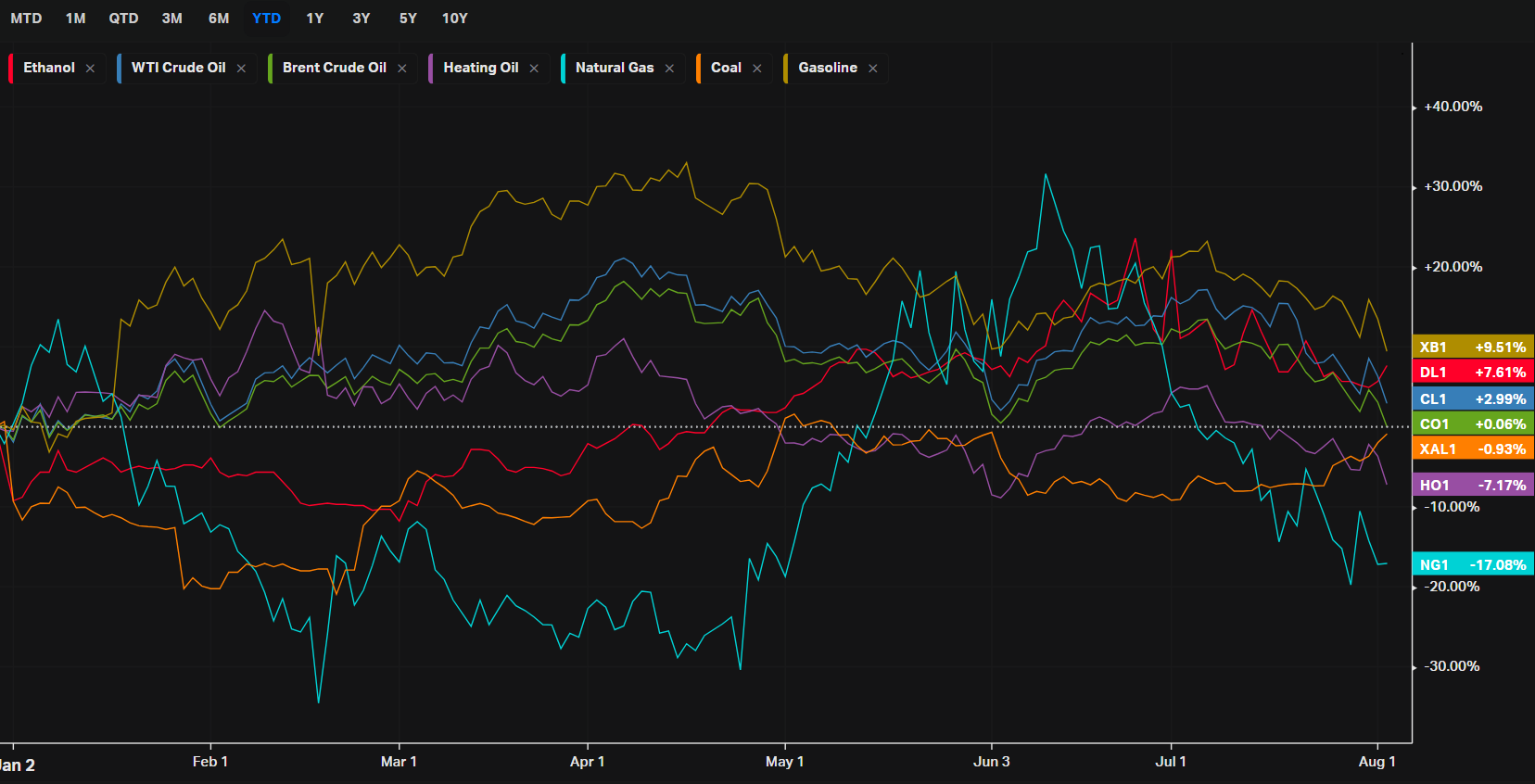
This chart highlights the year-to-date (YTD) performance of various energy commodities, showcasing the significant variations in returns across the energy sector. Here’s our quick breakdown:
Top Performers:
-
Gasoline (XB1):
-
YTD Performance: Up 12.85%.
-
Key Drivers: Gasoline prices have risen due to seasonal demand, refinery constraints, and geopolitical tensions affecting supply. The summer driving season in the U.S. typically boosts gasoline prices, and this year is no exception.
-
-
WTI Crude Oil (CL1):
-
YTD Performance: Up 7.28%.
-
Key Drivers: WTI crude oil prices have climbed due to supply cuts from OPEC+, especially Saudi Arabia, and a rebound in global demand as economies recover. The relative stability in prices reflects a balance between these factors and concerns over potential economic slowdowns.
-
-
Brent Crude Oil (CO1):
-
YTD Performance: Up 3.36%.
-
Key Drivers: Similar to WTI, Brent crude has benefited from global supply constraints and recovering demand. Brent often trades at a premium to WTI due to its broader international demand base.
-
Middle Performers:
-
Ethanol (DL1):
-
YTD Performance: Up 6.27%.
-
Key Drivers: Ethanol prices have seen moderate gains, supported by strong corn prices (as ethanol is primarily derived from corn in the U.S.) and steady demand for ethanol-blended gasoline. However, competition with other biofuels and policy changes can influence prices.
-
-
Coal (XAL1):
-
YTD Performance: Up 0.38%.
-
Key Drivers: Coal prices have remained relatively stable, with slight gains as demand persists in emerging markets and certain industrial sectors. However, the global shift toward cleaner energy sources limits coal's upside potential.
-
Underperformers:
-
Heating Oil (HO1):
-
YTD Performance: Down 6.51%.
-
Key Drivers: Heating oil has underperformed, possibly due to milder weather conditions in key markets and competition from alternative heating methods. Additionally, lower demand for heating oil during the warmer months could contribute to its decline.
-
-
Natural Gas (NG1):
-
YTD Performance: Down 9.22%.
-
Key Drivers: Natural gas prices have been the most volatile, with significant declines due to oversupply in the market, especially from U.S. shale producers, and lower-than-expected demand in the winter season. Additionally, increased production and storage levels have pressured prices further.
-
General Insights:
-
Energy Price Volatility: The energy sector is inherently volatile, with prices influenced by a complex mix of geopolitical events, supply-demand dynamics, weather conditions, and regulatory policies.
-
Seasonal Trends: The performance of commodities like gasoline and heating oil is heavily influenced by seasonal demand patterns, highlighting the importance of timing in energy markets.
-
Clean Energy Transition: The mixed performance of traditional energy sources like coal and natural gas reflects the ongoing global transition to cleaner energy, which affects long-term demand for these commodities.
This chart underscores the diverse factors driving energy markets, from geopolitical risks to seasonal demand, making it essential for investors to stay informed about macroeconomic and sector-specific developments.
Metals
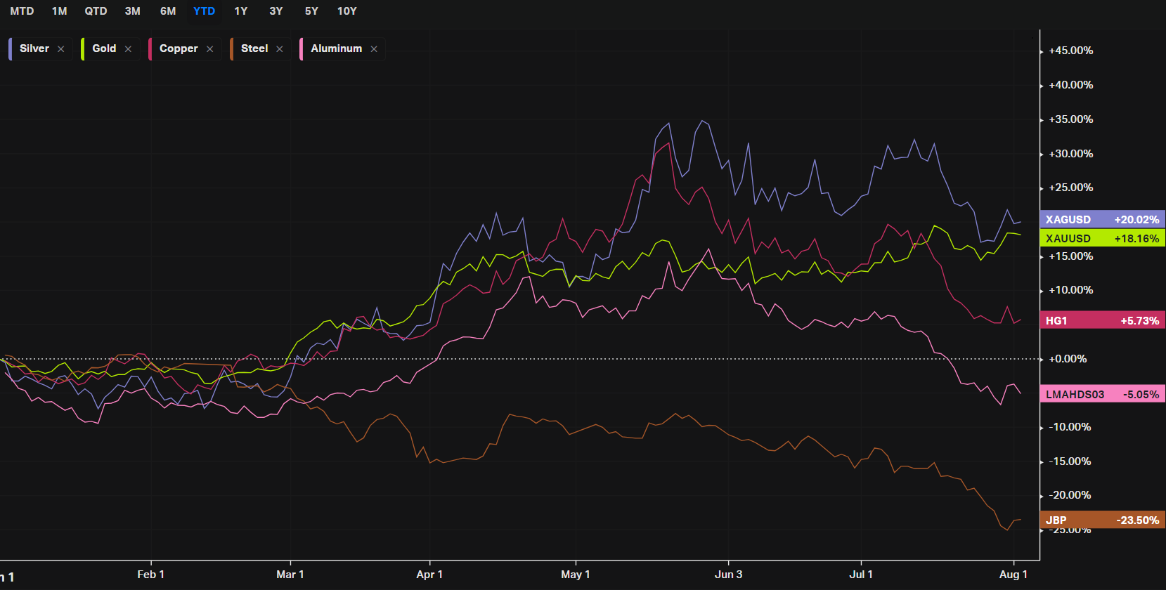
This chart illustrates the year-to-date (YTD) performance of various metals, highlighting the divergent trends within the sector. Here's a breakdown of the performance of each metal shown in the chart:
Top Performers:
-
Gold (XAUUSD):
-
YTD Performance: Up 17.66%.
-
Key Drivers: Gold has surged due to its safe-haven appeal amid global economic uncertainties, inflation concerns, and geopolitical tensions. Investors flock to gold as a store of value during periods of instability, driving up its price. Additionally, central banks' continued gold purchases have supported the market.
-
-
Silver (XAGUSD):
-
YTD Performance: Up 15.44%.
-
Key Drivers: Silver often tracks gold due to its dual role as a precious metal and an industrial metal. The strong performance in 2024 is largely tied to its safe-haven status and its use in industrial applications, including electronics and solar panels. The demand for green energy has particularly bolstered silver prices.
-
Middle Performer:
-
Copper (HG1):
-
YTD Performance: Up 2.35%.
-
Key Drivers: Copper is a key industrial metal, and its moderate gains reflect a balance between strong demand in the renewable energy sector and concerns over global economic growth, particularly in China. While copper demand remains robust for infrastructure and green technologies, its price has been tempered by economic slowdown fears.
-
Underperformers:
-
Aluminum (LMAHDS03):
-
YTD Performance: Down 3.65%.
-
Key Drivers: Aluminum prices have declined due to a mix of oversupply, particularly from China, and weaker demand in traditional sectors like automotive and construction. Additionally, the global push for recycling has increased aluminum supply, putting downward pressure on prices.
-
-
Steel (JBP):
-
YTD Performance: Down 23.63%.
-
Key Drivers: Steel has significantly underperformed, largely due to declining demand from key sectors like construction and automotive. The slowdown in China's economy, a major consumer of steel, has exacerbated these issues, leading to a sharp drop in prices. Additionally, oversupply in the global market has further weighed on steel prices.
-
General Insights:
-
Safe-Haven Appeal: The strong performance of gold and silver underscores the market's preference for safe-haven assets in 2024, driven by economic uncertainties and inflation concerns.
-
Industrial Demand vs. Economic Concerns: Metals with industrial applications like copper and aluminum have seen mixed performance, reflecting the tension between ongoing industrial demand (especially in green technologies) and broader economic slowdown fears.
-
Weak Demand in Construction: Steel's significant decline highlights the challenges facing traditional industrial sectors, particularly construction, amidst a global economic slowdown and reduced infrastructure spending.
This chart provides a clear snapshot of how different metals are responding to the current economic environment, with precious metals outperforming due to their safe-haven status, while industrial metals face headwinds from economic uncertainties.
Agriculture
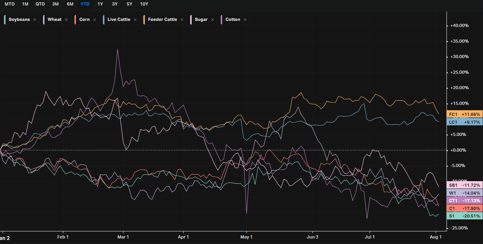
This chart shows the year-to-date (YTD) performance of various agricultural commodities, revealing significant disparities in how different sectors have fared in 2024. Here's a breakdown of the key trends:
Top Performers:
-
Feeder Cattle (FC1):
-
YTD Performance: Up 10.28%.
-
Key Drivers: Feeder cattle prices have been rising due to tight cattle supplies and strong demand for beef. Drought conditions in key cattle-raising regions have reduced herd sizes, leading to higher prices.
-
-
Live Cattle (LC1):
-
YTD Performance: Up 9.29%.
-
Key Drivers: Similar to feeder cattle, live cattle have benefited from reduced supply and high beef demand, both domestically and for export. The reduced availability of cattle for slaughter has supported higher prices.
-
Middle Performer:
-
Sugar (SB1):
-
YTD Performance: Down 9.98%.
-
Key Drivers: Sugar prices have been volatile, with fluctuations driven by global supply conditions, including weather impacts on production in key regions like Brazil and India, as well as changing demand dynamics. Despite recent declines, earlier spikes in prices were due to concerns over supply shortages.
-
Underperformers:
-
Wheat (W1):
-
YTD Performance: Down 13.73%.
-
Key Drivers: Wheat prices have declined due to strong global harvests and higher-than-expected production in major exporting countries like Russia and Canada. The easing of supply concerns has led to lower prices, despite geopolitical tensions impacting trade routes.
-
-
Corn (C1):
-
YTD Performance: Down 19.96%.
-
Key Drivers: Corn prices have suffered due to favorable weather conditions leading to strong crop yields, particularly in the U.S. Additionally, weaker demand for ethanol, which is made from corn, has put downward pressure on prices.
-
-
Soybeans (S1):
-
YTD Performance: Down 22.63%.
-
Key Drivers: Soybeans have been the worst-performing agricultural commodity in this group, with prices falling due to a combination of strong harvests and lower-than-expected demand, particularly from China, which is a major importer. Trade tensions and economic slowdown fears have further weighed on soybean prices.
-
-
Cotton (CT1):
-
YTD Performance: Down 17.12%.
-
Key Drivers: Cotton prices have dropped significantly, primarily due to weak demand in the textile industry. Slower global economic growth and high inventory levels have further exacerbated the decline in cotton prices.
-
General Insights:
-
Livestock Strength: The strong performance of cattle markets reflects ongoing supply constraints and robust demand for beef, which contrasts sharply with the weaker performance seen in crop markets.
-
Weather and Yield Impact: Weather conditions have played a significant role in the agricultural markets, with favorable weather leading to strong crop yields for commodities like corn and soybeans, resulting in price declines.
-
Demand-Sensitive Commodities: Commodities like cotton and sugar are more sensitive to changes in global economic conditions and consumer demand, leading to more volatile price movements.
Overall, this chart highlights the divergent trends within the agricultural sector, with livestock outperforming due to supply constraints, while crop prices have generally fallen due to strong yields and weaker demand.
Country ETFs
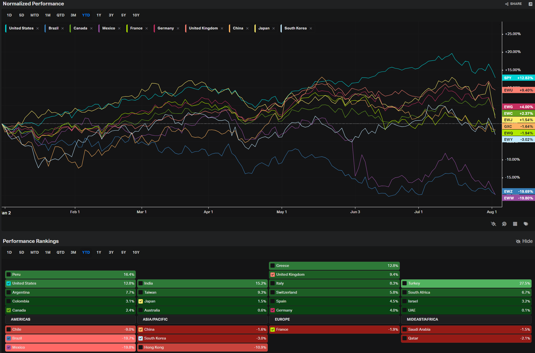
This chart provides a snapshot of the year-to-date (YTD) performance of various country-specific exchange-traded funds (ETFs), offering insights into how different global markets have performed in 2024. Here's a detailed analysis:
Top Performers:
-
United States (SPY):
-
YTD Performance: Up 12.85%.
-
Key Drivers: The U.S. market has been one of the strongest performers, driven by robust economic data, resilient corporate earnings, and investor confidence in technology and growth stocks. The S&P 500, represented by SPY, has benefited from the continued strength in sectors like technology, communications, and consumer discretionary.
-
-
United Kingdom (EWU):
-
YTD Performance: Up 9.18%.
-
Key Drivers: The UK market has performed well, supported by strong energy and financial sectors. The UK's export-heavy economy also benefited from a weaker pound earlier in the year, making British goods more competitive abroad.
-
Middle Performers:
-
Canada (EWC) and Germany (EWG):
-
YTD Performance: Up 4.10% and 4.07%, respectively.
-
Key Drivers:
-
Canada (EWC): Canada’s market has been bolstered by strong performance in the energy sector, as well as stability in financials and natural resources.
-
Germany (EWG): Germany’s moderate gains reflect the resilience of its industrial base, although concerns over energy supply and a slowing global economy have tempered returns.
-
-
-
Japan (EWJ):
-
YTD Performance: Up 2.67%.
-
Key Drivers: Japan's performance has been steady, with gains supported by the weaker yen, which has boosted export competitiveness. However, the market has faced headwinds from global economic uncertainties and domestic inflation concerns.
-
Underperformers:
-
China (GXC):
-
YTD Performance: Down 0.79%.
-
Key Drivers: China has faced challenges, including a slowing economy, regulatory crackdowns, and ongoing geopolitical tensions, particularly with the U.S. These factors have weighed on investor sentiment, leading to underperformance.
-
-
South Korea (EWY):
-
YTD Performance: Down 5.05%.
-
Key Drivers: South Korea’s market has been impacted by weaker demand for semiconductors, a key export, as well as concerns over slowing global trade. The country’s dependence on exports makes it vulnerable to global economic fluctuations.
-
-
Brazil (EWZ) and Mexico (EWW):
-
YTD Performance: Down 13.78% and 17.30%, respectively.
-
Key Drivers:
-
Brazil (EWZ): Brazil has struggled due to political instability, inflation concerns, and a slowdown in commodity prices, particularly in agriculture and mining.
-
Mexico (EWW): Mexico has faced significant challenges, including economic uncertainty, political instability, and concerns over U.S.-Mexico trade relations, which have dragged down market performance.
-
-
General Insights:
-
U.S. Market Leadership: The U.S. market remains a leader in global performance, driven by strong fundamentals and investor confidence in key sectors.
-
Mixed European Performance: While the UK has outperformed, other European markets like Germany and France have seen more modest gains, reflecting varied economic conditions and challenges.
-
Emerging Market Struggles: Emerging markets, particularly in Latin America (Brazil and Mexico), have underperformed due to a combination of domestic economic issues, political instability, and weaker commodity prices.
Overall, this chart highlights the varied performance of global markets in 2024, with the U.S. leading the way, while emerging markets and some developed markets face challenges from economic and geopolitical factors.
Yields
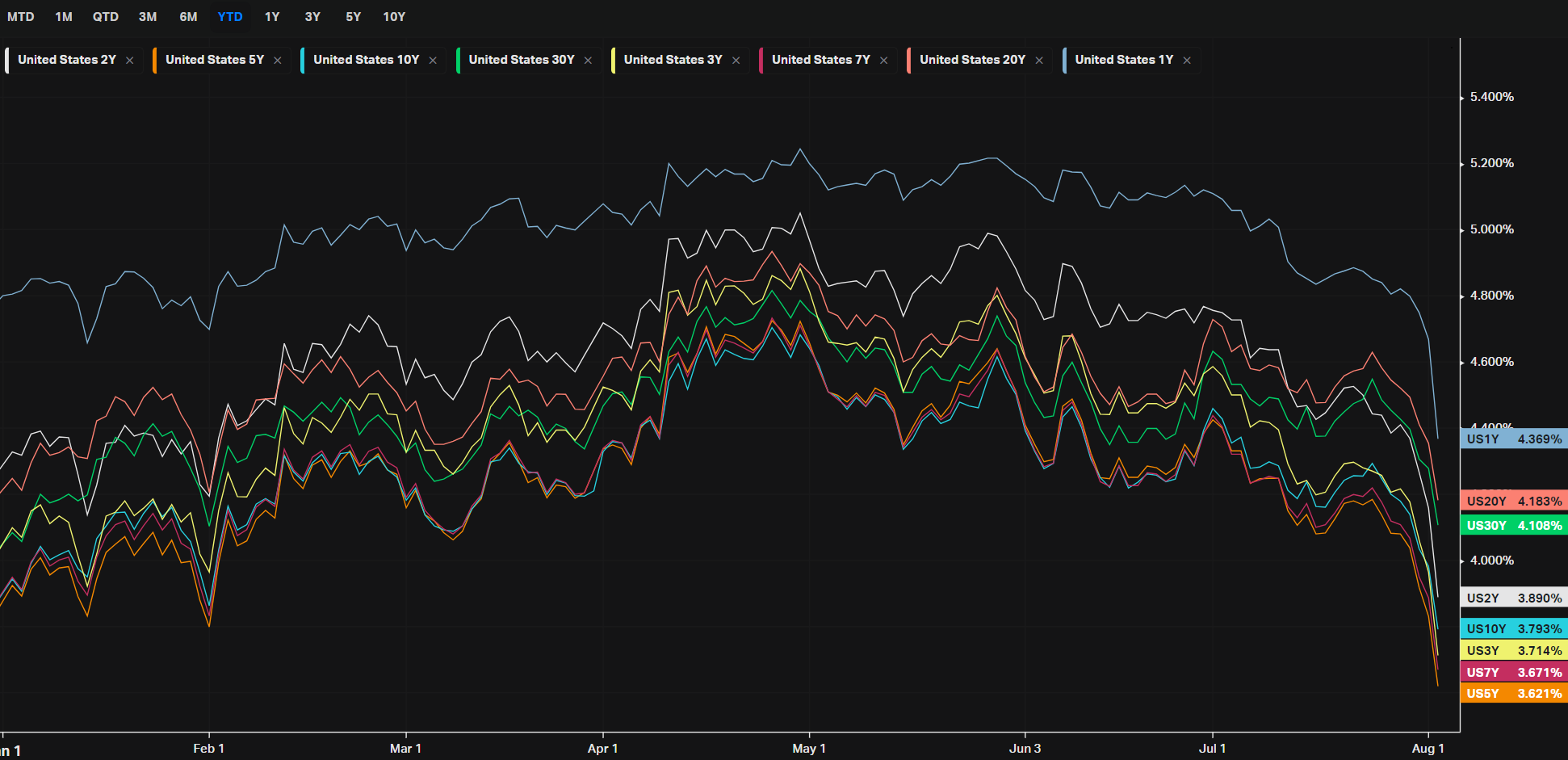
This chart shows various U.S. Treasury yield spreads, which are key indicators in understanding the bond market and economic expectations. Yield spreads compare the difference between yields on Treasury securities of different maturities, which can provide insights into investor sentiment, inflation expectations, and potential future economic activity.
Key Observations:
-
Yield Inversions:
-
5Y vs. 3M (USYC5Y3M): This spread is deeply negative, down -1.412% YTD. This indicates that short-term rates are higher than intermediate-term rates, which is a classic signal of an inverted yield curve. Yield curve inversions, particularly between short-term and longer-term maturities, are often seen as predictors of economic recessions.
-
10Y vs. 3M (USYC10Y3M): This spread is also significantly inverted, down -1.269%. The 10Y-3M inversion is one of the most closely watched indicators because it has a strong historical track record of predicting recessions.
-
30Y vs. 3M (USYC30Y3M): Similarly, this long-term spread is inverted by -0.989%, reinforcing concerns about long-term economic prospects.
-
-
Flatter or Positive Spreads:
-
30Y vs. 5Y (USYC30Y5Y): Up 0.423% YTD, this spread is positive, suggesting a steepening at the longer end of the yield curve. A steepening curve here indicates that investors expect higher long-term rates relative to mid-term rates, often due to expectations of future economic growth or inflation.
-
30Y vs. 10Y (USYC30Y10Y): Up 0.280% YTD, this also reflects a slight steepening between long-term maturities, suggesting a modest expectation of economic growth or inflation.
-
-
Mixed Signals in Mid-Term Spreads:
-
10Y vs. 5Y (USYC10Y5Y): This spread is modestly positive at 0.143%, indicating a slight steepening. However, the small magnitude suggests that investors are uncertain about medium-term economic prospects.
-
10Y vs. 2Y (USYC10Y2Y): This spread is inverted at -0.117%, but less so than the short-term spreads. This inversion is also a warning signal, though it is less severe than the 3M comparisons.
-
Yield Curve Inversions and Economic Signals:
-
Yield Inversions: The inverted yield curves, especially between 5Y/3M and 10Y/3M, signal strong market concerns about a potential recession. When short-term yields exceed long-term yields, it suggests that investors expect slower economic growth or even contraction in the near term. This is because investors are willing to accept lower yields for longer-term bonds, reflecting expectations that interest rates (and possibly inflation) will fall in the future.
-
Steepeners: The positive spreads in the longer-term curves (like 30Y vs. 5Y) indicate a steepening at the long end. This can happen when investors expect higher inflation or growth in the distant future, even as they are concerned about short-term economic prospects. A steepening yield curve in these segments can also reflect expectations that central banks might need to lower rates in the short to medium term, while long-term expectations remain anchored higher due to potential inflation or growth rebounds.
Summary:
-
Short-term pessimism: The deep inversions in short-term spreads reflect significant pessimism about the near-term economic outlook, with many investors preparing for a potential recession.
-
Long-term optimism or inflation concerns: The positive steepening in long-term spreads suggests that investors see potential for recovery or inflation further down the road, even as they remain cautious in the shorter term.
These yield curve dynamics are crucial for policymakers, investors, and analysts as they navigate the complex signals about the future of the economy.
Factors: Size vs Value
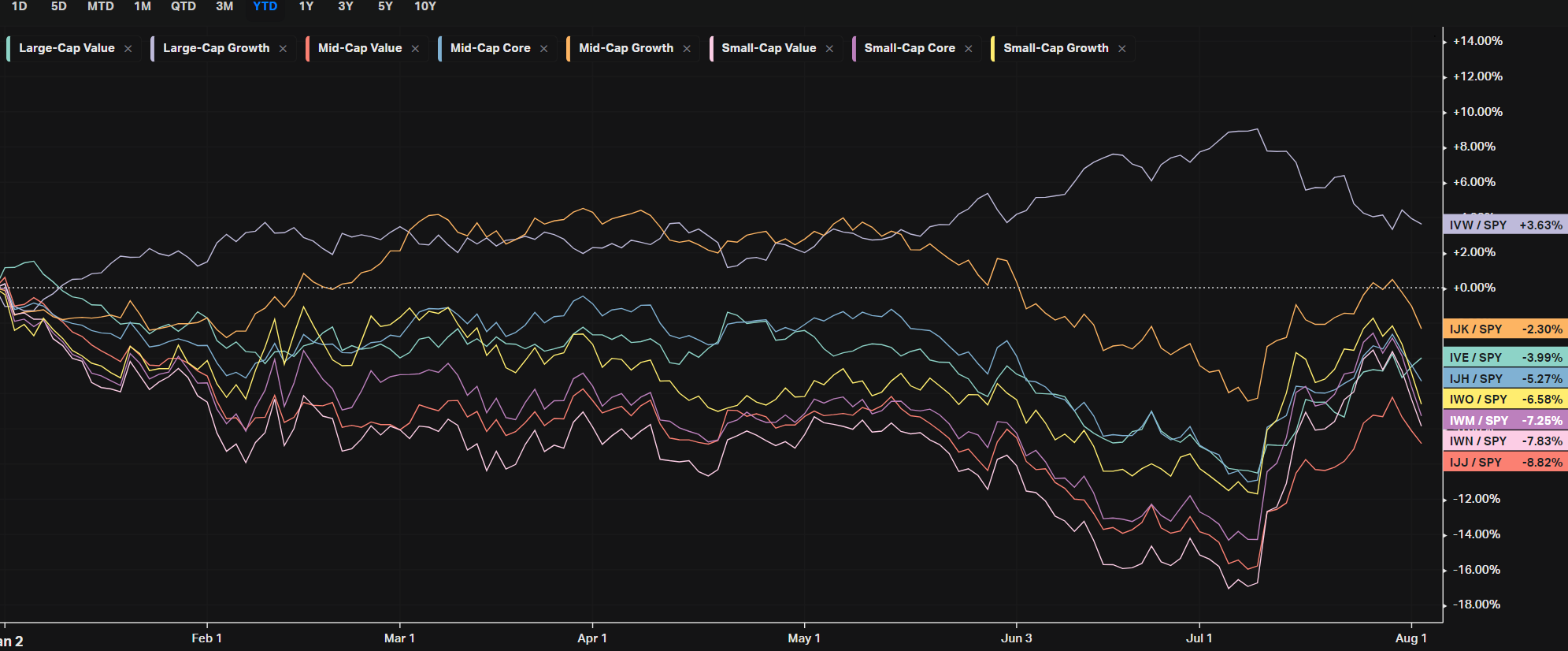
This chart provides insights into the performance of various investment styles categorized by market capitalization (Large-Cap, Mid-Cap, Small-Cap) and investment approach (Value, Core, Growth) relative to the broader market, represented by the S&P 500 (SPY), for the year-to-date (YTD) period.
Key Observations:
-
Large-Cap Growth (IVW/SPY):
-
Performance: Up 4.10% relative to SPY.
-
Key Drivers: Large-Cap Growth stocks have been the standout performers, benefiting from the strong performance of tech giants and other growth-oriented sectors. This reflects investor preference for companies with strong earnings potential, particularly in a low-growth macro environment.
-
-
Mid-Cap Growth (IJK/SPY):
-
Performance: Down 2.44% relative to SPY.
-
Key Drivers: While still better than many other segments, Mid-Cap Growth has lagged behind Large-Cap Growth. This might be due to investors favoring the safety and liquidity of larger companies during uncertain times.
-
-
Value Segments (IVE/SPY, IJJ/SPY, IWN/SPY):
-
Performance:
-
Large-Cap Value (IVE/SPY): Down 4.47%.
-
Mid-Cap Value (IJJ/SPY): Down 9.22%.
-
Small-Cap Value (IWN/SPY): Down 9.74%.
-
-
Key Drivers: Value stocks, particularly in the Mid- and Small-Cap space, have significantly underperformed relative to growth stocks. This underperformance is typical in environments where growth is scarce and investors are willing to pay a premium for companies that can deliver earnings growth. Additionally, sectors like financials and energy, which are typically classified as value, have faced headwinds.
-
-
Small-Cap Underperformance:
-
Performance: Both Small-Cap Growth (IWO/SPY) and Small-Cap Value (IWN/SPY) have underperformed, down 7.09% and 9.74%, respectively.
-
Key Drivers: Small-Cap stocks tend to be more sensitive to economic conditions and have struggled in 2024 due to concerns over rising interest rates, inflation, and slowing economic growth. Investors have preferred larger, more stable companies, leading to underperformance in Small-Caps.
-
General Insights:
-
Growth vs. Value: Growth stocks have significantly outperformed Value stocks across all market caps. This suggests that investors are favoring companies with strong earnings growth potential, particularly in a year where economic growth has been uncertain.
-
Size Factor: Large-Cap stocks have generally outperformed Mid- and Small-Caps, reflecting a flight to quality and safety during economic uncertainty. Large-Caps are often seen as more stable and less risky, which has made them more attractive to investors in 2024.
-
Market Conditions: The broader market's preference for growth and large-cap stocks over value and small-cap stocks suggests caution among investors, who are focusing on companies with strong balance sheets and growth prospects in a challenging economic environment.
Overall, this analysis indicates that in 2024, investors have leaned heavily towards Large-Cap Growth stocks, while Value and Small-Cap segments have struggled to keep pace.
Factors: Style
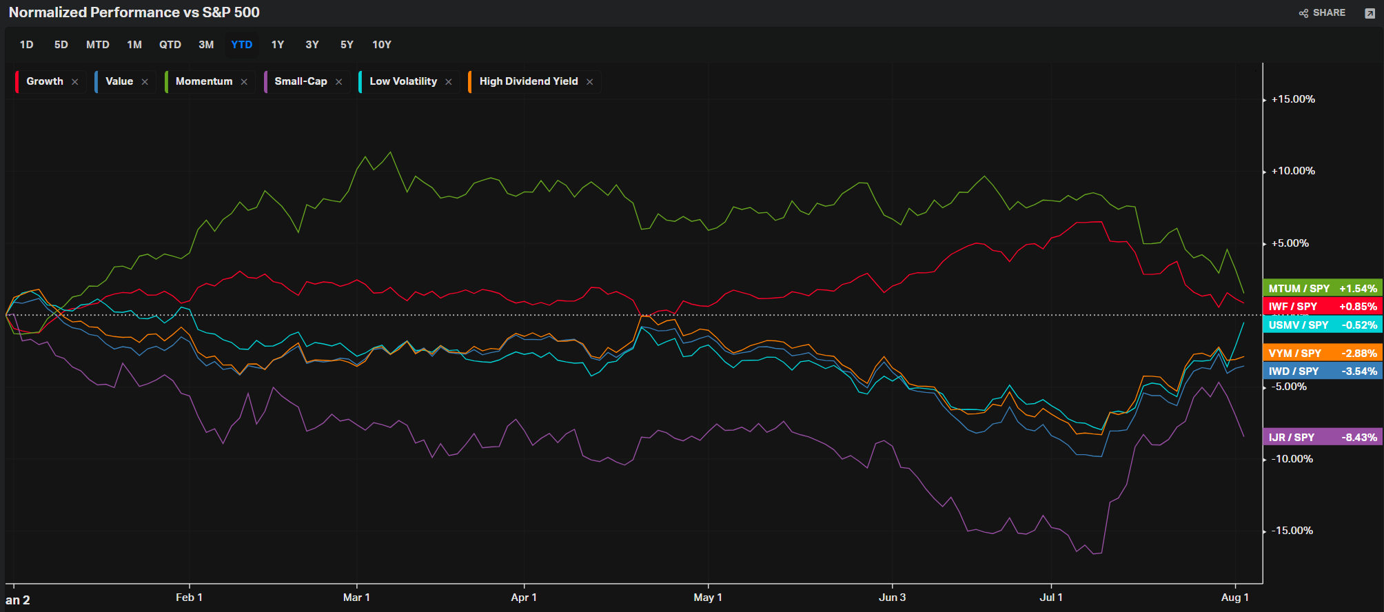
This chart compares the performance of different investing styles relative to the S&P 500 (SPY) on a year-to-date (YTD) basis. These styles include Growth, Value, Momentum, Small-Cap, Low Volatility, and High Dividend Yield. Here's an analysis of how each has performed:
Top Performers:
-
Momentum (MTUM/SPY):
-
Performance: Up 4.49% relative to SPY.
-
Key Drivers: The Momentum factor has outperformed other styles, driven by strong gains in sectors like technology and communication services. Momentum strategies tend to perform well when certain sectors or stocks experience sustained trends, which has been the case with tech-driven markets in 2024.
-
-
Growth (IWF/SPY):
-
Performance: Up 1.28% relative to SPY.
-
Key Drivers: Growth stocks have done relatively well, benefiting from investor interest in companies with high earnings potential, particularly in a low-growth economic environment. The strong performance of tech stocks and other growth-oriented sectors has supported this style.
-
Middle Performers:
-
Low Volatility (USMV/SPY):
-
Performance: Down 0.61% relative to SPY.
-
Key Drivers: Low Volatility stocks have slightly underperformed the broader market. This style typically does better in turbulent market conditions, as it focuses on companies with more stable earnings. However, the market's relative stability for much of 2024 has kept Low Volatility in line with broader trends.
-
Underperformers:
-
High Dividend Yield (VYM/SPY):
-
Performance: Down 3.10% relative to SPY.
-
Key Drivers: High Dividend Yield strategies have underperformed as investors have gravitated more toward growth and momentum plays. High-yielding stocks often come from sectors like utilities and consumer staples, which have lagged behind tech and other growth sectors.
-
-
Value (IWD/SPY):
-
Performance: Down 3.77% relative to SPY.
-
Key Drivers: Value stocks have struggled, continuing the trend where investors prefer growth and momentum stocks. This underperformance is linked to the challenges faced by sectors traditionally associated with value, such as financials and energy.
-
-
Small-Cap (IJR/SPY):
-
Performance: Down 9.28% relative to SPY.
-
Key Drivers: Small-Cap stocks have been the worst performers in this group. They are generally more sensitive to economic conditions, and concerns about rising interest rates, inflation, and potential economic slowdowns have weighed heavily on this segment.
-
General Insights:
-
Growth vs. Value: Growth and Momentum strategies have significantly outperformed Value, reflecting a continued preference for companies with strong future earnings potential, especially in the technology sector.
-
Defensive Strategies: Low Volatility and High Dividend Yield strategies have underperformed, suggesting that the market has been less focused on defensive plays and more on growth and momentum.
-
Small-Cap Struggles: Small-Cap stocks have lagged considerably, highlighting investor caution in this segment, likely due to concerns over economic stability and rising interest rates.
This chart provides a clear view of how different investment styles have fared in 2024, with a strong preference for Momentum and Growth over more defensive or traditionally value-oriented strategies.
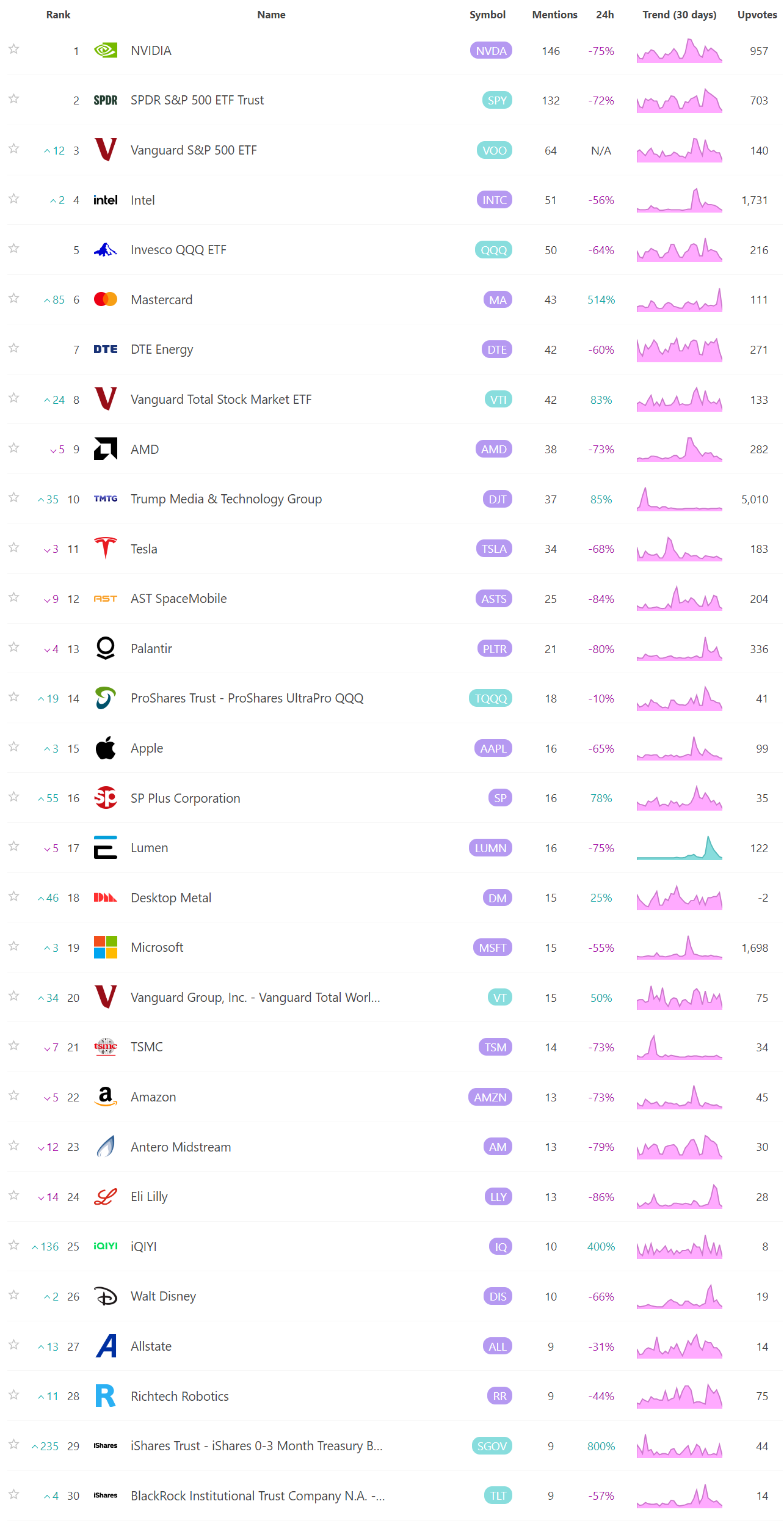
Social Media Favs
Most mentioned/discussed tickers on Reddit from some of the most active Subreddits for trading:
Events On Deck This Week
Here are key events happening this week that have the potential to cause outsized moves in the market or heightened short-term volatility.
Econ
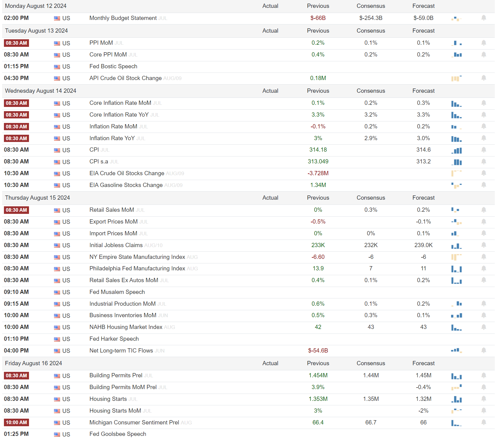
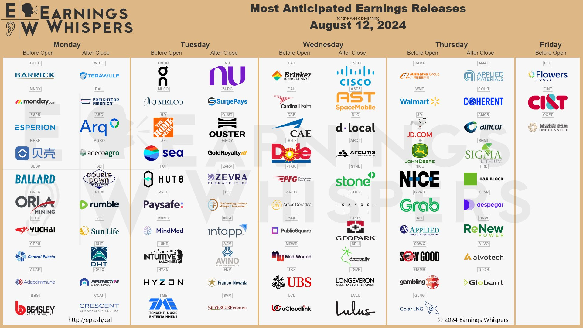
Earnings
A Final Word
Thank you for reading this week's edition of Market Momentum. If you found value in this content, please consider sharing it with a friend or colleague, in a Discord or a Tweet. This small favor helps keep this stack free for you! Please checkout VolumeLeaders.com for your own free trial of the platform that brings you the data powering this stack. Wishing you all a green week ahead filled with many bags �💰.
This article is from an unpaid external contributor. It does not represent Benzinga's reporting and has not been edited for content or accuracy.
© 2025 Benzinga.com. Benzinga does not provide investment advice. All rights reserved.