The noise surrounding the U.S. Interest Rate Market has been all Fed all the time. For headlines and theory, that’s great. For market participants who live in the real world, we like to focus on what the market is actually doing, not what a group of economists may or may not be thinking 8 times a year.
The real story is not what the Federal Reserve is saying. The story is that the yield curve is and has been narrowing. In other words, the spread between long-dated Treasury bond yields and short-term yields has been getting smaller and smaller. Notice how 2-year yields are hitting 5.5-year highs this week, but 30-year yields won’t budge as they remain near the same levels from a year ago.
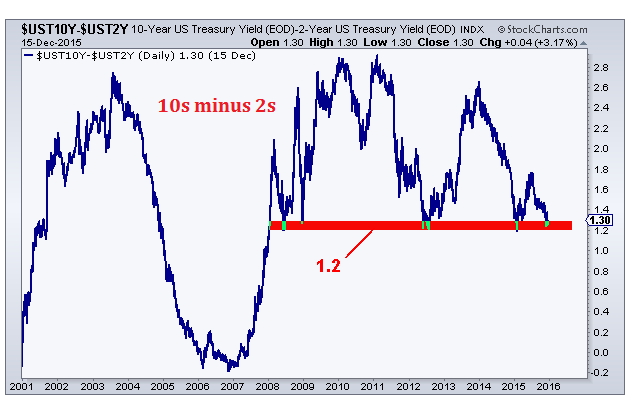
There are plenty of charts that tell this story well, but I think these two are enough to make the point. The first chart is the U.S. 10-year yield minus the U.S. 2-year yield. It is clear that this 1.2 level held as support in the summer of 2008, again in the summer of 2012 and once again this January. The more times that a level is test, the higher the likelihood that it breaks:

I would argue that when this yield curve finally breaks, we should see much more narrowing in the coming year and it’s tough not to think that the curve will invert like it did back in 2006-2007, right before the U.S. Stock Market collapsed.
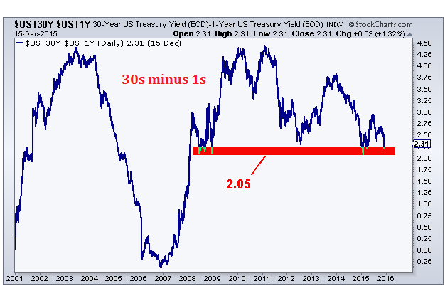
If you would like to get a bit more extreme, we can look at the U.S. 30-year yield minus the U.S. 1-year yield. It tells the same story, but from further points within the yield curve:

A break below 2 and change and this is in a lot of trouble. Look how the 2 and change level held throughout the second half of 2008 and once again this January. If this level breaks, I would expect further narrowing moving forward.
This is the real story. You see, normally longer-term interest rates are higher than shorter-term rates. The yield curve slopes up, reflecting better returns for longer-term investments. The problem is that this normally upward sloping curve is now flattening. This flattening of the curve, of course, is necessary before we can have an inverted one. I’m not going to get into economics here as this is not what we’re here to do. We’re only here to try and make money in the market. But history does suggest that since 1960, a yield curve inversion has preceded every recession on record.
I’m sure we will see some volatility in both the yield curve as well as in specific Treasury Bonds over the next couple of weeks. But when the dust settles, I believe these aforementioned levels break and the yield curve continues to narrow. This is the story. Not what the Fed says.
This was originally posted at All Star Charts. Click here to become a member.
Edge Rankings
Price Trend
© 2025 Benzinga.com. Benzinga does not provide investment advice. All rights reserved.
Trade confidently with insights and alerts from analyst ratings, free reports and breaking news that affects the stocks you care about.