With all the noise surrounding the recent sell-off in the U.S. stock market, it can be easy to forget that there are some areas of the market doing much better than others, and there is a lot of money to be made in the widening of those spreads. This is where intermarket analysis and ratio analysis can really become profitable for a portfolio. Today we are looking at the biggest companies in America, as a group, breaking out to new highs relative to the smallest companies in America: the Micro-caps.
What this ratio tells us, as investors, is the direction of the flow of money. Are institutional dollars flowing into the riskier, smaller companies in the stock market, or is it going into the larger, more traditional, relatively safer segment of the market that is, the Mega-caps. To me, there is no better gauge out there for the Mega-caps other than the old Dow Jones Industrial Average. The 30 components that make up this Index are 30 of the largest companies in America: Apple, Microsoft, Exxon, JNJ, General Electric, etc. When we compare this group to the Russell Micro-cap Index, we get a very clear picture of the direction of money flow.
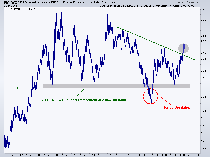
Here is a 10 year chart of the Dow Jones Industrial Average ETF DIA relative to the iShares Russell Microcap Index (ETF) IWC

What stands out to me at first glance is the failed breakdown in early 2014 below former support that went back to 2008. This key level was also the 61.8% Fibonacci retracement of the entire 2006-2008 rally. To start 2016, this ratio is now breaking out above the downtrend line from 2012. In my experience, that failed breakdown will be the catalyst to send this chart soaring back towards those former highs from 2008 and 2011. That’s a long way to go.
We’re looking at another 17% to the upside in this chart that I think can happen quickly. This potential return comes with a long position in the Dow Jones Industrial Average and an equivalent short position in the Russell Micro-cap Index. That’s one way to take advantage of this, from an execution standpoint.
On the other hand, just looking at this from an analytical perspective, if my thesis is correct and this breakout in Mega-caps relative to micro-caps is for real, then we’re looking at a serious shift out of the more speculative micr0-cap stocks and into the more conservative, “safer”, mega-cap names. This is not something that usually occurs when the market overall is going up, but normally on when it’s on its way down.
This fits in well with my overall bearish thesis coming into the year. I’ve been pounding the table to be short, and that there is a lot more downside coming. So I have to say that I am happy to see this particular ratio confirm what we’re seeing elsewhere.
This was originally posted on All Star Charts
Edge Rankings
Price Trend
© 2025 Benzinga.com. Benzinga does not provide investment advice. All rights reserved.
Trade confidently with insights and alerts from analyst ratings, free reports and breaking news that affects the stocks you care about.