With more and more trading platforms and the growing allure of low-to-no-fee brokerages, new traders are confronted with a deluge of options when it comes to trading and investing. But lost in the promises of sleek interfaces and free shares for signing up is the fact that successful trading takes time, practice and an understanding of resources experienced traders use on a daily basis.
With that in mind, we’re going to use this new series of articles to take a look at the charts, ratios and indicators that play an integral role in how traders generate ideas and form convictions on their medium- or short-term trades. To do that, we’ll be using the charts and tools available on the Webull trading app, which offers traders access to real, zero-commission trading in addition to a suite of advanced trading analysis and charting.
Volume-Weighted Average Price
For active traders who are entering and exiting positions with some frequency, volume becomes a greater component of interpreting stock moves and anticipating upcoming activity. For those unfamiliar, volume is a measure of the number of shares that exchanged hands in all of the transactions that occurred in a given period. You’ll often see volume statistics displayed in a bar-graph format below.
However, volume on its own is not especially useful. It’s only when compared to preceding levels or against mean statistics or as a component of a technical indicator that current volume readings hold any significance.
Among the most heavily referenced volume-based indicators is volume-weighted average price, or VWAP. Like it says on the tin, VWAP is a measure of price action, but with greater emphasis on price points at which there is higher volume.
It does this by averaging out the volume-weighted prices of every trading period over a given span against the total volume in that span. These volume-weighted prices are calculated by multiplying a given period’s typical price (the average between the high, low and closing prices) and multiplying that by the total volume of that period.
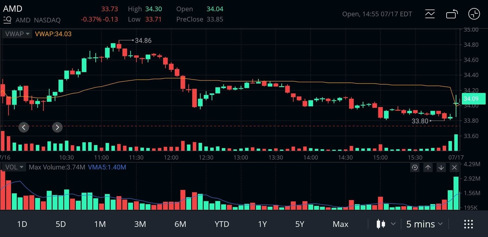
For instance, take this five minute-chart for Advanced Micro Devices, Inc. AMD from Webull. The individual points that make up the orange VWAP line correspond to each five minute trading period. Each point incorporates the sum of all of the volume-weighted prices from all of the preceding five-minute periods and divides that by the total volume of shares traded up to that point.

Chart courtesy of Webull
This obviously smooths out the price action within a given day and can serve as an illustration of a longer-term trend in a stock.
However, VWAP is most commonly used as a reference for intraday activity. Referring back to the AMD chart, you can see some interesting interactions between the stock’s actual price moves and the VWAP line.
For one, look at the points between 10 am and noon at which the price chart intersected VWAP. These points in and of themselves are often read as bullish and bearish crosses, respectively. You can see the length of the candles grow immediately after these crosses, which indicates a widening spread between the high and low prices.
Aside from that interaction, VWAP can also serve as an important level of support or resistance. You can see in the AMD chart how the candles only briefly graze the VWAP line just after 1 pm before receding through the rest of the afternoon.
While Vwap can be a powerful tool as traders increase the speed and frequency of their positions, it’s important to keep in mind that VWAP is a lagging indicator, meaning all of its insight is drawn from prior information. This is not meant to diminish its usefulness, only to dissuade traders from looking to the humble VWAP for the next big spike.
Webull is a content partner of Benzinga
© 2024 Benzinga.com. Benzinga does not provide investment advice. All rights reserved.
Comments
Trade confidently with insights and alerts from analyst ratings, free reports and breaking news that affects the stocks you care about.