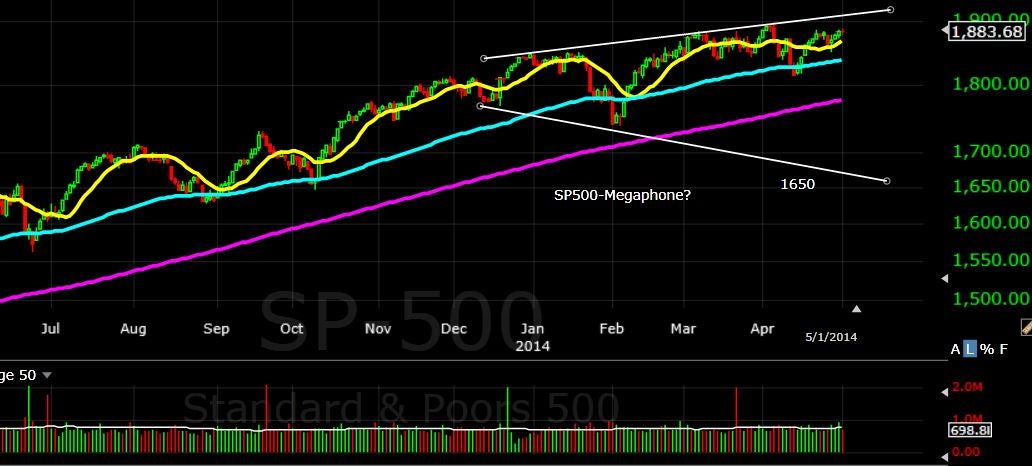
The SP500 and Nasdaq indexes have risen from their lows in mid April that gave traders and investors a chance to buy the so called dip. Now however the chart patterns that are forming could be showing a bearish tone setting up in the markets. Take a look at the SP500 chart below, the megaphone pattern forming here is ultimately a bearish setup.
The SP500 could continue to rise up to the 1900 level before turning and falling quite precipitously to the lower end of the trendline around the 1600 area, a drop of around 15% or more.
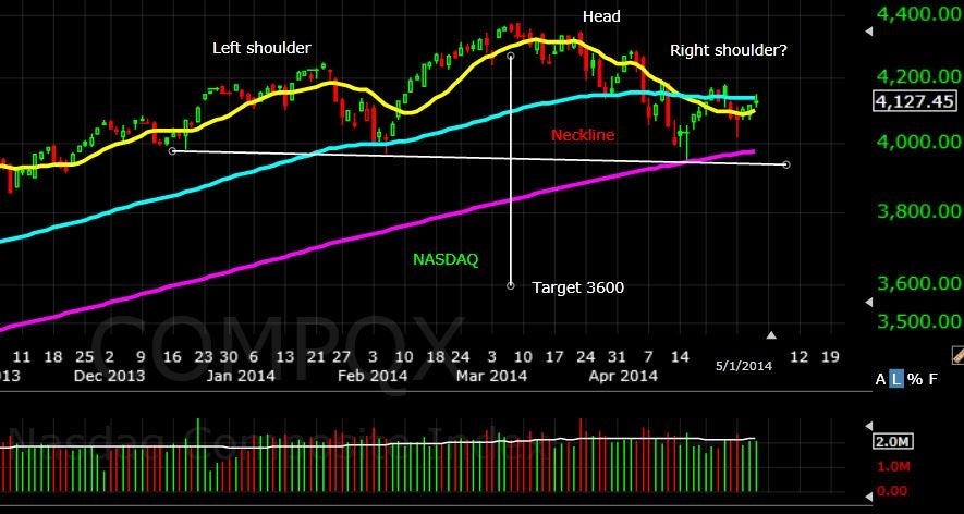
 The NASDAQ has been forming a reverse head and shoulders pattern that if it follows thru could drop the index to the 3600 area. The neckline break of around 3900 would take the drop to about a 15% correction. See chart below.
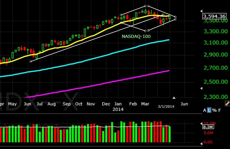
 Making things even more interesting the weekly chart of the NDX 100 index is now setting up a possible bearish diamond pattern. First stop could be the 89 week moving average around the 3100 area before possibly falling further.
 Traders and investors should keep an eye on the patterns as they may be forecasting a very healthy correction. The recent rotation into late bull market sectors such as oils and consumer staples along with the sell in May and go away theory being discussed may be then Indexes giving us a warning of things to come.
Risk is always a factor in these setups, so size your trades to your own personal risk tolerance.
(Chart courtesy of TC2000)
Traders and investors should keep an eye on the patterns as they may be forecasting a very healthy correction. The recent rotation into late bull market sectors such as oils and consumer staples along with the sell in May and go away theory being discussed may be then Indexes giving us a warning of things to come.
Risk is always a factor in these setups, so size your trades to your own personal risk tolerance.
(Chart courtesy of TC2000)
© 2025 Benzinga.com. Benzinga does not provide investment advice. All rights reserved.
Trade confidently with insights and alerts from analyst ratings, free reports and breaking news that affects the stocks you care about.

