To be honest, the plan was to present an in-depth review of the outlook for inflation on Wednesday.
To be sure, nothing can kill a bull market faster than an uptick in inflation. And with the May data showing that there just might be some inflation percolating at the present time, it seemed a good time to broach the subject.
However, this week's selling in the stock market, which appeared out of nowhere, has been enough to make investors sit up and take notice. So, given that there was no obvious catalyst to the pullback and that the decline has been quite spirited in some areas, the discussion on inflation will have to wait.
Today, it is time to dig into the action in an effort to try and make some sense of the decline.
For starters, let's agree that a pullback of 1.09 percent on the S&P 500 SPY is nothing to get upset about.
Especially when the bears have been essentially locked out of the game for the past two months. No, with stocks overbought, an extended rally, and sentiment becoming a bit giddy, a pullback was certainly to be expected at some point.
However, some of the action has been a little out of the ordinary.
But, let's start with the chart of the S&P itself shown daily and see what we can see...
S&P 500 Daily
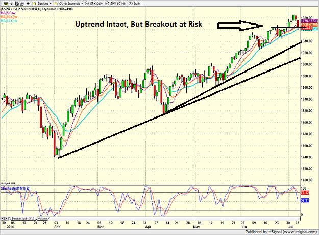
As one can see, the uptrend lines on the S&P remain intact. As such, those investing for the intermediate- to long-term time frame needn't be too worried.
However, for those who see the market as vulnerable to a meaningful decline or those who trade using a shorter-term time horizon, the test of the recent breakout area is a little disconcerting.
In short, should the S&P 500 close meaningfully below the 1960 area, it is a safe bet that the bears will likely test the 1940-45 zone. And if our furry friends can produce enough fear to break below 1920, well, things could get ugly in a hurry.
And unfortunately, the S&P's chart is the good news as the story becomes progressively weaker as one review the rest of the other indices.
Let's start with the venerable Dow...
Dow Jones Industrial Average Daily
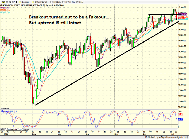
For example, the DJIA appears to have embarked on the dreaded "breakout fakeout" as the Dow was able to stay above the magical 17,000 level for just a couple days.
Thus, the next battle ground for the Dow will be the uptrend that has been intact since the beginning of February.
So, for those keeping score at home, the key levels for the DJIA are currently 16,800 and 16,700. Respectively, these represent the uptrend line and near-term support. And if 16,700 gives way, the bears will likely be rolling.
Next up is the NASDAQ, which up until just recently had been a laggard. But as of last Thursday, it looked like four-letter land was once again the place to be.
NASDAQ Composite Daily
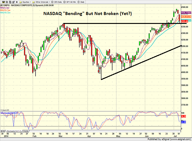
As the chart above shows, it hasn't been a good couple of days for the NASDAQ. But then again, the tech-heavy index had popped up 10 percent since the middle of May. And since the rate of ascent was simply unsustainable, some sloppiness would be normal.
The good news is that the NASDAQ stopped where the bulls needed it to on Tuesday - right at important support. And if the bulls can regain their mojo in the next day or so, the action of the past two days will be viewed as simply a pullback within an ongoing uptrend.
However, if 4350 gives way, it might be a different story.
Now let's turn our attention to our old friends - the "momentum meltdown" names. AKA the Biotech, Internet and Social Media sectors.
SPDR Biotech ETF XBI Daily
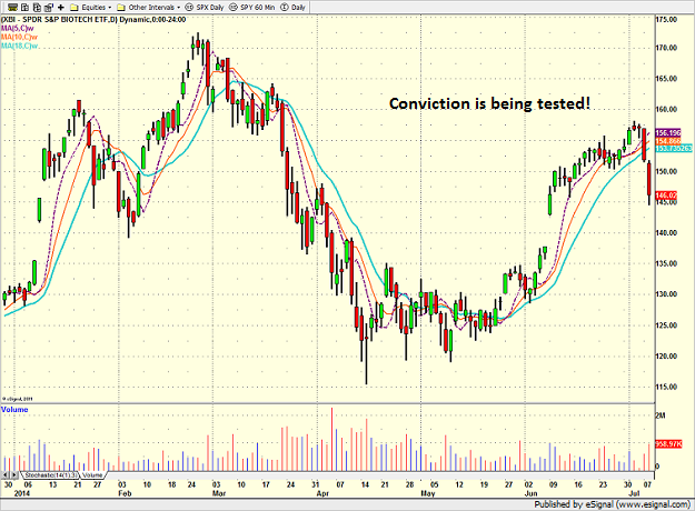
After popping nearly 30 percent from May 8 through July 3, again, some profit taking was to be anticipated. However, the voracity of the decline coupled with the increase in volume seen over the last couple of sessions is a little unsettling.
Sure, this could be a case of algos-gone-wild as there has undoubtedly been a fair amount of millisecond trend-following happening this week. But at the very least, we will have to say that anyone who has enjoyed the recent bounce from the mo-mo meltdown is having their conviction on the trade tested right about now.
Speaking of algos-gone-wild, take a peek at the internet sector...
First Trust Internet ETF FDN Daily
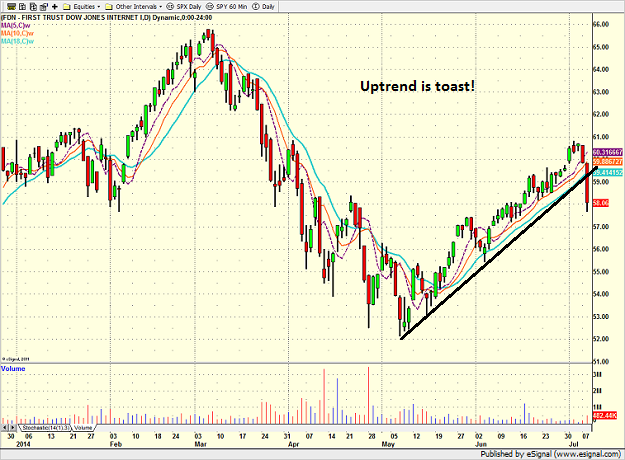
While Tuesday's decline in the First Trust Internet ETF was only about three percent, the chart is now U-G-L-Y. There is almost nothing positive to say after the quick dive.
The uptrend is toast, all of our favorite moving averages have been violated, and near-term support is wanting.
Thus, it appears that the very same traders who trashed the sector for a loss of nearly 20 percent during the momentum madness seen in March and April, are back at it again.
And since we're on the topic of high-flying tech stocks, let's peruse one more chart... the Social Media Index.
Global X Social Media Index ETF SOCL Daily
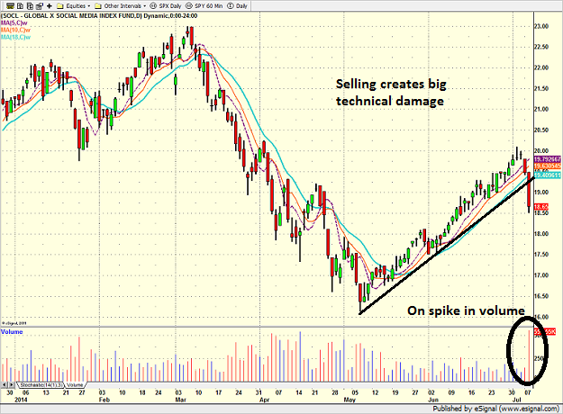
With names like Yelp YELP, Gogo GOGO, Pandora P and LinkedIn LNKD having been the poster children for this spring's momentum meltdown, it is little surprise that these very names are getting smoked again this week.
And again, there is nothing positive one can say about this chart. The uptrend was scorched, the MA's all broke and the bears are "feeling it." Exhibit A here would be the volume spike on the SOCL ETF. Wow - somebody was doing some serious selling/shorting here!
So, the bottom line appears to be that the same sellers who printed money by attacking the former mo-mo leaders are hoping that it's going to déjà vu all over again during what is supposed to be the summer doldrums on Wall Street. The question, of course, is whether or not the blue chip indices will once again be able to avoid the carnage that is taking place in the small-cap and former high flier camps.
The answer will likely become clear as the action unfolds around the important technical levels on the S&P and DJIA. So stay tuned, this could get interesting.
© 2025 Benzinga.com. Benzinga does not provide investment advice. All rights reserved.
Trade confidently with insights and alerts from analyst ratings, free reports and breaking news that affects the stocks you care about.