Let's put our technical analysis hats back on today. On Thursday, I introduced you to trading ranges, breakouts, and breakdowns. We'll take this analysis one step further today and look at six important technical patterns.
These all require a basic understanding of trading ranges, resistance and support lines. If you missed Thursday's issue where I discussed these, view it on our blog website here.
Now, I'd like to discuss the first three technical patterns. Tomorrow, I'll follow up with three more.
Double tops or bottoms: In this common pattern, price trends repeatedly move toward the top or bottom of a trading range. A double top forms when the stock price spikes close to resistance, retreat, and then spikes once again.
When a stock's price double tops without successfully breaking through resistance, technicians believe it foreshadows a decline in price. So the expected stock price movement to watch for following the double top is for the price to move downward.
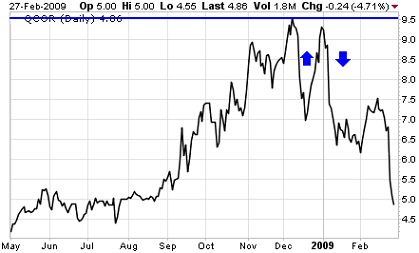
Questcor Pharmaceuticals (Nasdaq: QCOR) experienced a double top between December 2008 and January 2009 as the chart below clearly shows. As the pattern often foreshadows, the double top was followed by a sharp decline in price.

In a double bottom, the opposite occurs. Price trends down to support and spikes twice, only to retreat. This anticipates a rise in price after the double bottom.
Double tops and bottoms are very common patterns. They are easy to spot and interpret. However, as with all patterns, a double top or bottom can also be misread. False indicators do occur, so it helps to have some experience in chart interpretation and a working knowledge of a company's fundamentals.
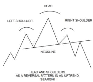
Head and shoulders: In this chart pattern, price spikes upward in three parts. The first and third represent the outline of a figure's shoulders, and the second is the head. The head spike is typically higher than the two shoulders and often reaches right to the level of resistance.
Prices tend to fall following a head and shoulders formation. This is a fairly reliable pattern, and the total amount of the decline is usually twice the difference between the neckline and the top of the head.
The illustration below from my book, The Small-Cap Investor: Secrets to Winning Big with Small-Cap Stocks, clearly shows this pattern.

A reverse head and shoulders displays the same pattern, but on the downside and at support. It consists of three downward price spikes, with the middle one (the upside down head) moving lower than the first and third shoulders. It usually precedes a price increase.
Triangles: The triangle is most often a continuation pattern, which means it confirms the current trend and gives a signal that price is going to keep moving in the same direction (up or down). Some very specific triangle patterns can also be reversal signals, which mean the current trend is slowing down and price levels may turn in the opposite direction in the near future.
There are two primary triangle patterns: ascending and descending. Triangles generally start out with their widest trading range and then narrow.
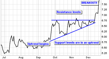
An ascending triangle is characterized by a narrowing trading range with price levels finishing on the higher side of the range, or even culminating in a breakout above previously established resistance.
This is a bullish pattern for the stock. Below is a six month chart for a technology stock in the Small Cap Investor PRO portfolio. After moving higher following an uptrend, the price of the stock reaches a wall of resistance. Each time the price moves up to the resistance point it quickly moves lower. Buyers are still interested in the stock, so each downward move is met with buying. As a result, each pullback brings less downward movement. Finally, the buyers overwhelm the stock and the price quickly breaks out above the former resistance level. You can learn more about Small Cap Investor PRO here.
Ascending Triangle Pattern

Conversely, a descending triangle ends up with the narrowest portion ending on the lower side - near support - or even breaking out beneath it. This is a bearish signal and, just as the ascending triangle implies a continuing upward trend, the descending triangle implies that the downward trend is going to continue.
Just like most things, understanding technical stock price movement takes practice. But to a trained eye, a stock chart can give the astute investor an idea where the stock price may go. Practice before you act, and gain confidence. You'll be glad you did when you start to make profitable trades.
© 2025 Benzinga.com. Benzinga does not provide investment advice. All rights reserved.
Trade confidently with insights and alerts from analyst ratings, free reports and breaking news that affects the stocks you care about.