I am sure that you are aware that the Dollar Index can't get a bid. This isn't news but a fact. The Dollar Index is in a down trend, and the question to ponder is: how low can it go? Looking at the price patterns, I believe the Dollar is at significant risk of unraveling.
Figure 1 is a weekly chart of the Dollar Index (symbol: $DXY). The black dots over the price bars are pivot points, and as we can see, price closed last week below the two most recent pivot points (labeled 1 and 2). To understand the significance of this occurrence, let's design a study where we sell short the Dollar Index when the Dollar Index closes below two weekly pivot points. We will exit our positions after holding for 13 weeks. Commissions and slippage are not considered, and all signals are executed at the close. We will be looking at price data going back to 1974. The purpose here isn't to design a trading strategy, but to understand how the current price action could lead to a significant decline in the Dollar Index over the next 13 weeks.
Figure 1. $DXY/ weekly

Since 1974, this strategy produced 53 trades with 66% being profitable. The strategy generated 84 Dollar Index points; over this time period, the Dollar Index has lost a negative 22 points. The equity curve for this strategy is shown in figure 2, and essentially, this is the type of equity curve that you want to see when designing a strategy -- a nice persistent, consistent upward sloping rise.
Figure 2. Equity Curve

But as stated, we aren't trying to design a trading strategy, but we would like to determine when the Dollar Index might be at risk for sustainable and significant losses. To do this we need to look at the maximum favorable excursion (MFE) graph (see figure 3) from this strategy.
Figure 3. MFE graph
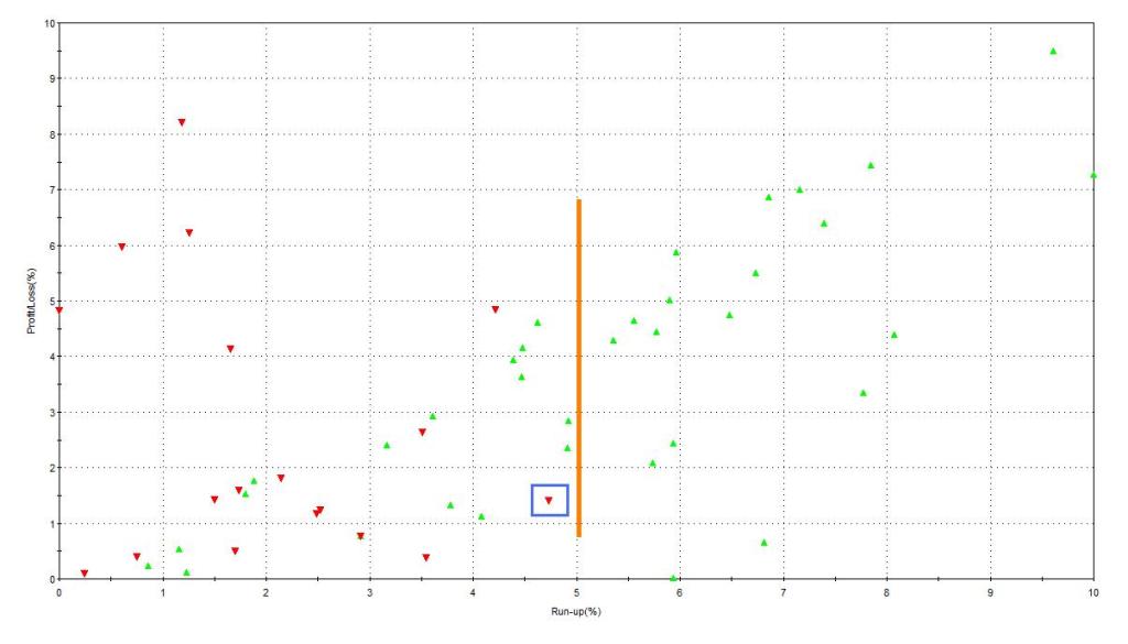
What is MFE? MFE looks at every trade from a strategy, and it assesses how far a trade moved in a profitable direction before being closed out for a profit or a loss. Looking at the trade inside the blue box in figure 3, we note that it had a run up or profit of 4.7% (x- axis) but it was closed out for a 1.4% loss (y- axis). We know that it was a losing trade because the caret is red. So what is the MFE graph for this strategy telling us? 18 out of the 53 trades (33%) had an MFE over 5%. (This is to the right of the orange line on the graph.) In other words, 13 weeks after this pattern is recognized, there is a 33% chance of a significant loss in the Dollar Index.
Rather than using a time stop (i.e., 13 weeks), let's cover our positions when price closes above two prior pivot points. This is the mirror image of our entry, and in this case, we are letting price (not time) take us out of the market. In this strategy, there were 28 trades and 64% were profitable. This strategy yielded 95 $DXY points since 1974. The average trade lasted 27 weeks, which is twice as long as the above study. If you remain in the market longer and allow price to take you out of the market, you get the MFE graph shown in figure 4.
Figure 4. MFE graph
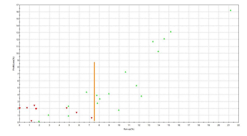
13 out 28 trades had an MFE (or run up) greater than 7.5%. (This is to the right of the orange line). 9 out of 28 trades had an MFE greater than 10%.
So what is the bottom line? A close below two pivot points on a weekly chart puts the Dollar Index at a high risk of unraveling.


© 2024 Benzinga.com. Benzinga does not provide investment advice. All rights reserved.
Comments
Loading...
Posted In: Information TechnologySystems Software
Benzinga simplifies the market for smarter investing
Trade confidently with insights and alerts from analyst ratings, free reports and breaking news that affects the stocks you care about.
Join Now: Free!
Already a member?Sign in

